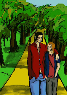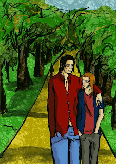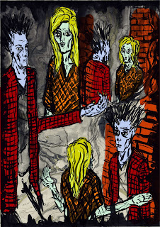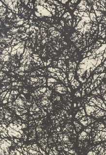
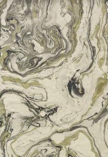
 I've done quite a bit of messing around on Photoshop with my comic pages. This has mainly been colouring my pages but I've also explored playing with the backgrounds. I found some really cool paper in an art shop near where I live, I didn't know what I'd use t for at the time but it was really cool a knew I would find use for it at some point. The paper was handmade and had a really awesome sort of rough texture. I felt it would go really well with my kind of rough style I usually default to when I have no reason to use a particular style. I got plain hand made paper and two patterned ones; one with a marbled pattern and one with a black line-y pattern.
I realised when looking at my A3 comic pages that these patterned pieces might make good backdrops for the images.
I tried both and found that the marbled background actually works really well.
I was later colouring a full page image and kept feeling like the image was lacking somehow. I played around with using the paper as a layer and decided it worked really well at adding texture to the background so put it in over the background but behind the figures. I think the end result was very effective.
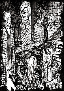 A big problem I've had with colouring on Photoshop is that the colours kept being too bold and bright. I tried to select more muted colours but this made too many of the colours similar or didn't make much difference. Bright and bold colours can be good sometimes but it didn't really fit with the mood I'm trying to set. Also a lot of what happens is at night so it wouldn't make sense for everything to be all bright and colourful. I got around this issue by colouring with the bright colours but at the end creating a layer over everything except the line work and filling the layer with a colour that sets the right atmosphere and reflects the setting and then changing the opacity of the layer until I think it dulls the colours in the way I want.