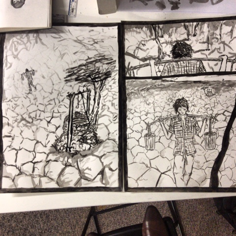
 The last two days I have attended a book making workshop. A lot of it was about different ways of approaching making unique style artist books that open in weird ways and have bits that pop up etc. I tried making pop up bits because it looked rather simple. This lead to me drawing my normal style drawings over bits of paper that would be cut up and raised. This lead to my normal drawings but in a context where they could be altered to appear strange and distorted. This had a really cool visual that I definitely want to explore further. Also work in the context of a book is just really cool. The fiddly precise nature of making a book does not play to my strengths however so I embraced a rough, mismatched look that I believe I could support with my style. This could develop to create a really strong sense of aesthetic.
I also learned Japanese book binding. This was fiddly, tricky and confusing at the time but in hindsight I quite liked it. I really like the boom I made and although I made mistakes with the stitching and did some things in the wrong order it still holds together and I want to explore this method more. It seems like a good option for a one off artist book that doesn't need multiple copies. I think the aesthetic could be tinkered with to mirror the images I'd put inside to make a book, like my other one I made, it's good to have options.


