Monday, 11 January 2016

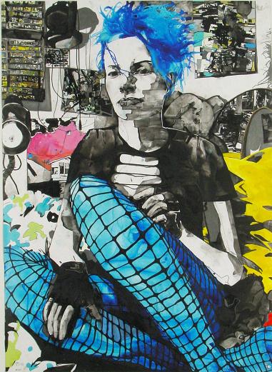
As a continuation of my style project I really need to start taking photos of my own. There are many problems with this as there is a particular style I want that is really quite hard to just come across, especially in Huddersfield, but I'll work with what I can get and am developing strategies to better achieve the aesthetic I want. An aspect that through my work I have discovered is almost as important as the style and aesthetic of the model is the pose of the figure. To practice arranging a pose and such I borrowed a camera and practised taking photos of my friends, the sort I'd take when I have actual models I would draw.
     
I had quite a bit of trouble with doing this, more than I thought. I looked through previous drawings and tried to get people in similar clothes but struggled to get anything I really like, especially at first. I did learn a lot though and improve over the day. I think my main problem was improvising the poses, I really need to make some template poses to give me a basis to work on. Another trouble I had was working around the type of clothing they were wearing. This hopefully wont be such an issue when I take my actual photos to work from as my models then will hopefully be wearing clothing more similar to the style I want and am used to drawing.


Sunday, 10 January 2016

Jamie Hewlett

Jamie Hewlett is one of those artists I really like, about half the time, but always forget about. His work appeared on my tumblr the other day when I was just sort of browsing about for influence and I remembered how much I liked (some) of his work. Hewlett is most famous (and known by me) for his work behind the band the Gorillaz in which he has a very unique cartoonish but semi detailed and precise style. I really like how strong and defined his style is.

I was looking at his work trying to figure out if it related to my project at all when I came across a series of Tarot cards he had made.  The illustrations on these cards weren't particularly interesting to me but I really liked the card context of the work . I have been playing around with putting my work  into the context of a series, currently exploring this by making my work smaller and smaller and at the moment is very similar to card size itself.(http://mqltv.com/wp-content/uploads/2015/09/cartas-tarot-jamie-hewlett.jpg)
 These aspects were on my mind later when I saw three packs of cards on my bookshelf. I looked at these cards and decided it would be interesting to start drawing a series of work on these cards. This way the material itself interlinks the series of work naturally and not just because multiple similar drawings are put next to each other. It also adds another element to my work other than the figure itself which is something I've been thinking about lately.


His Gorillaz work and also his Tank Girl work have more of an influence on my comic work. The main problem (one of many) that I have with my comic project is figuring out a strong consistent style, the thing I most like about Hewlett's work. The thing about his work are there are some very distinct features to his figures that are throughout his work, similar angular, thin body shapes, pointed faces with a protruding jaw etc. In short there is less variety between the people he draws than there is in life. This sounds like it should be a negative but apparently it's not. There are a few reasons for this; his drawings are good, Jamie clearly knows what he's doing and is achieving the look he's going for, more than I can say for my work. This is something I really need to work on as I have no idea how I want my drawings to look like really.
(https://evaakessonscriticaljournal.files.wordpress.com/2014/01/01bff2a9.jpg)(http://www.phaidon.com/resource/sponge-finger.jpg)


Saturday, 9 January 2016

Zak Smith

I realised that my favourite artist, Zak Smith, is actually very useful for my current project. I recently bought The Zak Smith book 'Pictures of Girls' as I've wanted all of Zak's books for a while now and this one was reduced Amazon. I was gushing over it when I realised how similar his work was to mine. Being my favourite artist my work is pretty much influenced by his by default, but this is usually in a stylistic sense, in my use of ink and how to balance colour and black and whiteness. For the majority of my work this project however I've not used ink and been using colour in a different way so Zak's work didn't seem to have much sway. Looking through the book however I realised I'd been an idiot for missing the strong link between my current work is, not in style but simply subject matter. Unsurprisingly 'Pictures of Girls' is filled with Smith's various portraits of girls, girls with a strong sense of style, similar to the type of people I've been drawing but a bit more alternative. The girls he paints are usually very posed also like the pictures I've been drawing. This makes Smith's work very useful in figuring out how to compose the people in my drawings and how to convey different styles of clothing. I can look at how he uses these aspects to convey a personality from his models, which is also important to my work.
One of the most interesting aspects of Zak's work is his incredibly detailed backgrounds done heavily in ink that contrast the figure. My work completely lacks this using no or only abstract backgrounds. This is mainly due to wanting the work to be about the figure but seeing how Zak uses background to compliment the figure, improving the image but not detracting attention at all leads me to think that developing a background style for at least some of my types of work could work very well.

 (http://photos1.blogger.com/blogger/6699/1331/1600/v_in_corner_cd2.jpg)
(http://www.creativityfuse.com/wp-content/uploads/2011/01/Temper-Acrylic-painting-by-Zak-Smith1.jpg)

Friday, 8 January 2016

Scott McCloud

Half for my Contextual studies and half for for my main project...and half because I wanted to I read 'Understanding Comics' by Scott McCloud. This is a terrific book in which Scott talks about almost every aspect of comics you could think of, from history, to layouts, to philosophy, it is all covered.
Honestly it's crazy how much this guy knows about comics
The most relevant and helpful parts of the comic is the chapters about what happens in the gutter between panels and how time work in comics, both these are related.
He talks about how though not shown the audience makes assumptions about what happens outside the panel and how this works to not only fill in the missing spacial information but to fill in movement and time that passes. He describes this process as 'closure'. He talks about how comics can push this auto filling by the audience, changing setting while leaving a clear image of what is happening to the reader. He talks about the importance of the reader filling in in their own head what happens between the panel and how this makes comics a collaborative experience.
Scott then lists the types of panel to panel transitions, He lists 6 along with examples and when they would be used and the amount of closure they use, some leaving very little to the audience to do and some leave everything to them making the comic as much about what isn't there as is.
There's a lot more said about this which is very useful and interesting but I can't go on forever so I'll move on
Talking about time in comics McCloud hits on how time can move within one panel and how it can move across multiple panels and how the passage of time can be controlled within these. He talks in depth about how within comics time and space are one in the same (like it is in real life but way less complicated). The final main element he discusses is how the amount of visual information in a panel changes how long the panel lasts in a viewers mind and how this effects it's timing.

There is so much more to talk about but it would be just reciting the book. Not only that the information is so blatantly useful I don't even have to talk about how it effects my work. The essence though is there are a hell of a lot of variables to making a comic (I was already aware of this) and they are all very important. Taking them all into account takes a lot of practice time and effort. This makes me think I was right to just dive into making pages for my comic and although I'll make many mistakes (hopefully little ones) I'll learn and develop as I go seeing first hand the importance of these aspects.

Thursday, 7 January 2016

More artist blogs

Wes Craig- http://wescraigcomics.tumblr.com/
First off can we just appreciate how nice Craig's blog looks, the banner at the top with his art style looks awesome and the black background really compliments his art. Like most of the artist's blogs I've looked at Craig mostly just posts pictures of his art, he posts a lot of progress shots of his comic pages. These progress pages are really interesting, mainly in how he draws his roughs, with some sort of black marker and how much detail he 'inks' before digitally colouring the pages (something I've been trying to figure out in my own work). The rest of the blog is notices about events he'll be attending and answering questions. At the side he has links to his other social media sites and where you can purchase his work but that's about it.

Eric Hibbeler- http://erichibbeler.tumblr.com/ 
Eric's blog is much like everyone else's. He only posts sketches though (very rarely completed work) accompanied with about a line of why he's done the sketch such as 'just practising poses' etc. At the top  he to has links to other places you can buy or see his work. I really like the layout of his blog, how you see two posts side by side and how visually impacting it is but also how simple the layout is. This whole aesthetic would simply be ruined if he posted large chunks of writing. The option to ask him questions is there but I imagine he answers these privately as I never see them come up on his blog.

Eric Scott Pfeiffer-http://ericscottpfeiffer.tumblr.com/
Eric posts a range of his work, from progress comic stuff to sketches to the sort of work that you can buy as prints and such.  He'll post a little line giving the work context and maybe saying how it was done but that's all and sometimes the posts will act as an advertisement for some upcoming project. He also has the typical links at the top of his page and the option to ask him questions, though these never appear on his blog. The layout isn't as nice as Craig's or Hibbeler's as the range of work gives an aesthetic dissonance the one by one large nature of how the work is posted and displayed just doesn't have the impact or beauty of how Hibbeler's work is displayed.

Wednesday, 6 January 2016

Blogs of artists

I've looked at the blogs of a few artists that I'm interested in, I already followed all of them anyway but I'll write about a few of them here
Fiona Staples http://fionastaples.tumblr.com/
Fiona's blog is interesting in that it's not very focused around her work. She'll post work related to projects of her that are coming out soon such as comic covers and she'll post the occasional sketch that otherwise wouldn't be seen but that's about all from her own work. I hypothesise that this is the case for a lot of illustrators because due to doing work for others can't freely show much completed work before it's made public and probably by the time they would be allowed to post it they've moved on.
Due to this (possibly) Staples' blog is filled mainly with things that interest her. This is mainly art from artists she likes or knows. Sometimes she'll write a little about why she likes the work. It's also not a very busy blog, I suppose this is because she is busy doing actual work. The rest of the blog is her answering people's question about her work and process which is some of the most useful content of her blog.
Zak Smith http://zaksmith.tumblr.com/
Zak Smith's blog is different to Staples' blog in that it is entirely his own work. This may be because he is more of a fine artist so is in control of all his work and has a larger existing body than Staples does. Smith's blog is mainly pieces of his work along with the title and possibly a line about it but little else. Recently he has started selling prints of his work on things: phone cases, cushions etc, through an online shop and he's started to post a lot of links and examples of these items. Zak also does a lot of writing, often about art and the state of the art world and he posts articles/rants or links to articles on his blog too. Zak also fields questions through his blog but less often and publicly than Staples.
Cameron Stewart http://cameron-stewart.tumblr.com/
Cameron almost only posts pictures of his work and everything else is related directly to his work. Like Smith he doesn't write much to go along with his work, only basic information about it. He has a lot of sketches mainly (though his sketches aren't exactly sketchy) and a few complete works that he's selling as prints, along with links to where you can buy more of his work. He also has sort of adverts for upcoming releases of his comic series. An observation about his and Staples' blog is they are quite light hearted and humorous about their work, which I appreciate. Their blogs aren't overly serious or professional, they are more a reflection of themselves. This is important because as they are both on tumblr they are very interactive with a wide variety of audience who aren't exactly searching them out to hire them but for their entertainment.

Tuesday, 5 January 2016

Rob Ryan

I saw a Rob Ryan exhibition at the Yorkshire Sculpture Park. I was already familiar with his work having been introduced to it during a paper cutting workshop I took a few years ago. I found his work impressive and initially liked it visually quite a bit but I found myself loosing interest in it very quickly. This exhibition reinforced this first opinion.
At first I was pleasantly surprised looking at his exhibition, caught up in the amount of detail and all the minutiae he manages to achieve through paper cutting and how time consuming and focused the work must be, though the fact he has quite a few assistants helping with doing the actual paper cutting was constantly in my mind.
After a few minutes of looking at his exhibition however I was starting to get bored, it was all so similar, using similar patterns and techniques throughout while not branching out stylistically enough. This is good in that Ryan has an iconic look but I find his style is far too specific, though I guess this could just be a symptom of paper cutting where it appears to be harder to vary your way of doing things. I did like that things were varied a bit size wise but it wasn't really enough to keep my interest.
Image result for rob ryanI do visually like his work though, I just find it too aesthetically similar for it to keep my interest on it's own. I did feel like Ryan's work would be well suited to some sort of supporting role, or something where the art isn't the only focus. It turns out this happens as Rob Ryan has a few illustrated books. I looked through one of these called The Kingdom Revealed (2014). I really enjoyed the book on a visual level and the art in it did seem to be the main focus. I think the addition of narrative helped elevate my interest in it. He did use a combination of digital and paper cutting in the book however and this shows as the illustrations have a lot more variety than the work in his exhibition.

Mainly Rob Ryan has me thinking about style in my own work. I have several ways of approaching my work so varying my work style wise isn't an issue and all these methods are aesthetically coherent so that isn't an issue either. The main thing on my mind is making sure I hit the right balance in my series of works where I use a similar style. I want the pieces in my series of works to support and elevate each other but I don't want the work to be so similar that they make each other boring like Ryan's work does to me. Due to the flexibility of the materials I use in comparison to paper cutting this shouldn't be too much of a struggle.
(http://www.tagfinearts.com/rob-ryan.html)
(http://rob-ryan.blogspot.co.uk/2013_07_01_archive.html)

I just had a revelation about my issue with Ryan's work. Aesthetically similar but unrelated work has no interest to me, but if the work is related then it then it suddenly becomes much more interesting. This simply reconfirms my artistic philosophy that work in a series is just a lot more compelling than anything stand alone.


Monday, 4 January 2016

Deadly Class, Remender and Craig

Deadly Class (2014-) is a comic series published by Image and written by Nick Remender and illustrated by Wes Craig. I have been looking at Deadly Class quite a bit recently as it is a useful reference for my own comic and I am studying for my long essay, which is comic focused. Deadly Class is a useful comic because Wes Craig is a master of laying out pages in interesting, unique, busy yet clear ways. I can't think of a single other comic that lays its panels out in such a dynamic way. Actually, J. H Williams III's Sandman Overture run is pretty uniquely and creatively laid out, however being about dreams and magic his pages are less clear and are dynamic in a different, more chaotic way.
While comics such as Saga, Rat Queens and Paper Girls have relatively large panels, rarely going over 6 or 7 panels and often having splash pages or those with as few as 2 or 3 panels, Deadly Class has many pages with over ten panels and very few pages only have a few panels on them. I put this disparity between panels per page down to what I call movement and atmosphere panels. Movement are little panels, often focused on one element that subtly changes from panel to panel, several may be used where only one or two could, and often would be used. Craig uses several instead to control pacing and in text timing or build a certain atmosphere. These can also be used to bring attention to minute details such as a clenched fist or eye movement.
Atmosphere panels are panels that do not do much for the narrative progression of the comic but do give a situation atmosphere and give some minutiae to the event, things such as an unrelated figure shouting on a phone, a close up on a smoking cigarette etc. Craig usually uses a few of these in a row (like an opening montage) when introducing a new scene or place and it really is effective for setting mood, also depending on the size and shape and frequency of the panels they effect the pacing of the story as well. (http://thelatestpull.com/2015/01/comic-review-deadly-class-10/)

Craig uses another type of unique panel I'll call close ups. This is where he'll draw a larger scene and then put small panels within the scene showing the details of things going on. This is used to show multiple things going on at once or to give the reader a clear idea of what is going on in general and specifically all at once.

These types of panel are useful for thinking of ways of making my own comic clearer layout way as well as giving me new ways to compose panels so I don't have to keep using the same methods which would get stale. When applying Craig's methods to my own work (to create atmosphere, control pacing etc,) I need to make sure they fit with the overall aesthetic of my pages. A Wes Craig style page would be out of place and break immersion if inserted in any other comic for instance. Still I can take his techniques and tweak them to my own style, or tweak my style to better fit in the elements Craig prioritises, such as pacing, movement, atmosphere.
(http://wescraigcomics.tumblr.com/post/69608241426/2-pages-from-deadly-class-1-out-in-january)
2 pages from DEADLY CLASS #1 (out in January)
(http://houseofflyingscalpels.com/2014/05/02/deadly-class-4-the-trials-and-tribulations-of-tormented-teenagers/)