Monday, 10 November 2014
Saturday, 8 November 2014
For my big group drawing I encountered a lot of problems. The first was trying to find a suitable picture of a group of people, most of whom are touching in some way. This was actually quite hard to get and most of the photos I had that fit my criteria were blurry. I went ahead with one of the blurry photos anyway because I've done drawings from photos like that before and confident I could make it work.
I did the piece on some strange textured, canvasy paper because it was the only kind of paper I could get at the time which was anywhere near the size I wanted and I wanted to start on it immediately. I realise now I should have done a few quick practice pieces on this paper that was new to me. I projected the picture of the figures up and traced them on with graphite. After I was finished I inked the figures with a brush and black ink. I found that this type of paper was actually really good for brush and ink work. The textured nature of the paper makes it good for holding ink and easily getting different tones. At the time I was actually worried that I'd worked into the figures too much.

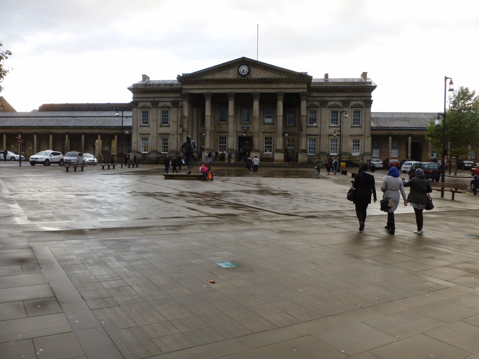
I then projected a picture of the train station onto the figures and traced over the portion of the picture which overlapped the figures. I tried a few different photos at different sizes and chose which one fit best. I chose the photo below as I thought it filled each figure pleasantly and in a way that would capture your interest.
I had trouble when it came to penning the building. The fine liner type pens I usually use for this job didn't really work on the textured paper so I had to use a thicker bolder pen. I thought this still might work since I'd used this pen with inked figures earlier in the project. It came apparent though that the building was strongly overpowering the figures. This was particularly bad because the drawing of the building wasn't very good itself. I used a projector and ruler for this drawing to get the structure solid feel of the building but my inexperience of using both was showing.
On top of everything the pens were running out. I finished the main group of linked figures and decided to take a different approach for the two left. I didn't see the point in continuing a failing system. I switched to using sharpies (a different colour for each figure. This is something I had tried for a different piece but I thought would make this drawing too full on and the building too powerful. I also followed the penciled projection less strictly going back to more of a loose instinct type drawing but still with a ruler. I think this technique worked better but still the quality of the drawing itself isn't that great and doesn't work as well as some of my previous work.
I then projected a picture of the train station onto the figures and traced over the portion of the picture which overlapped the figures. I tried a few different photos at different sizes and chose which one fit best. I chose the photo below as I thought it filled each figure pleasantly and in a way that would capture your interest.
I had trouble when it came to penning the building. The fine liner type pens I usually use for this job didn't really work on the textured paper so I had to use a thicker bolder pen. I thought this still might work since I'd used this pen with inked figures earlier in the project. It came apparent though that the building was strongly overpowering the figures. This was particularly bad because the drawing of the building wasn't very good itself. I used a projector and ruler for this drawing to get the structure solid feel of the building but my inexperience of using both was showing.
I still have to add the bits of colour to the black and white figures. I don't know if it will work very well with them being so full and ill defined but I might as well try it as I've already messed them up and it might actually make the image better. Something I have to think about is do I add the supporting colour to the two figure who already have colour in them? I did to a previous piece I did with colour but that one was full of colour already. It did work really well and created a great visual impact though. I think I might. It would link the two to the other group more as well.
Saturday, 1 November 2014
Here are some experiments with colour for movement and energy and different types of line. I felt like using a ruler for the straight edges of the building gave it a really solid structural look but using a thicker pen than usual might have made it a bit overpowering. I also used ink to try and give the figure a more organic feel and to widen the gap between the line used for the figure and the building. I originally tried this without penciling the figure first but thought this compromised the quality of the drawing too much so then tried it with pencil first and think that works better. I don't think that the use of colour for the first image is that effective either, it may be too dark and not loose enough. For the next image though I really like the trailing brush strokes, especially those around the feet as I think it adds a great sense of movement. I think I'll stick to just them for moving people. I really like how this all looked combined with the building being drawn in colour to as it just made the whole image so vibrant and lively. I don't know if that's what I want from the drawing of the building though. Maybe I'll tone the colour work down a bit and see how it works then.
I was talking about the way I'm using line with Ian the other day. The issue with line in my current work is I essentially use the same type of line for everything in my work. This is because I like my natural sketchy line as I think it makes work more interesting and is different to the usual type of line you see in most art. There are some problems with it though and trying to get a difference between the figure and the building in my work is one of them. Ian suggested I look at Patrick Caulfield as an example of someone who uses a completely different kind of line, solid, definite and straight. I would have a lot of trouble drawing a line like this usually as I have shaky hands that make it hard to draw a continuous solid line and keep control (it does give me my natural drawing style which I prefer though). This means to get lines like Caulfield's (or maps which we also looked at the use of line in) I'll have to use a ruler. If I do this for the building on the inside but draw the people free hand then hopefully that should give a big enough difference in line.
(source: http://standpointmag.co.uk/files/u28/Art---Prodger.jpg)
Veronica Lawlor is an artist Gill told me to look at when it came to thinking of ways to add colour to my work that will work with my concept. The main thing I get from her work is using colour as a type of line and as as a tool to add liveliness and energy to a piece when appropriate, such as the piece to the right which needs some vibrance because it's time square. By toning down some of the ways in which she uses colour I can apply it to my own work to give a sense of life to my figures while keeping a nice balance with the building within them. I'm going to adapt this style by going over the lines of the figures I draw with multiple loose colours probably with gouache or maybe ink. (source: http://www.gallerynucleus.com/assets/attachments_p/000/019/544/size500_Times-Square-Lawlor.jpg
Subscribe to:
Posts (Atom)

