I've tried developing my method of dealing with hippies. I felt like while making work on Photoshop helped get the bold and striking colours that I felt were appropriate but made the image too rigid and confined for free, loving, spirit-y hippies. I felt there needed to be a more loose style. I started experimenting by using watery gouache loosely to define the figure then going round the detail with ink that expanded in the watery gouache. I thought this method worked well. It was probably the best of the techniques I tried; it has an air of spirituality about it. This may be more down to the composition though. Next I tried a style more similar to the one I used for my work on punks and new romantics. This involved loose ink work that I thought might suit the hippie aesthetic I was going for. It may have been too dark and not as detailed as I would have liked however. then splattered some ink loosely over it to try and give it the colourful vibrant aesthetic I want. I thought this looked okay but was maybe too colourful; almost in a childlike sort of way. To try and get a way where I could use a similar method but hopefully get the detail that I wanted I tried working on a bigger scale. I still found it hard to get detail in ink while keeping the colourfulness I wanted and avoid making it too dark with tone and therefore more like my other work. After colouring the original drawing I thought putting a colourful background similar to the type I tried before but first I soaked the paper in water so the ink spread and merged more. Overall I think this background was more effective than the first method as it's bit more subtle but still powerful and atmospheric. It creates a kind of hazy effect that I think suits hippie culture. I like how the background merged into the figure itself adding a kind of detail that I failed to put in before and and giving the skin a cool abstract colouring that I liked.
I thought about making the colourful paper that I posted about earlier from the these pieces. Unlike other subcultures where I've used this paper however, I thought this would make the image too rough and harsh for the aesthetic I was going for.


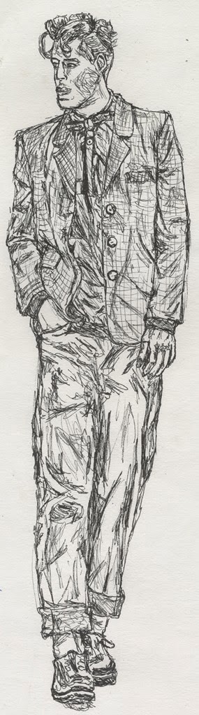
 Originally when I started this project I did drawings just to get used to the aesthetic of the subcultures. While doing this I started to develop slightly different styles or use different materials to help represent each group and reflect their own style. For example I tried a detailed, intricate pen drawing for Teddy Boys, a rougher pen style for mods, a pen and ink mixture for skin heads etc. I try developing the technique until I think it is representative of the subculture. I don't have much reason to why I choose a particular style or material for a particular culture other than it seems to fit that group well. For instance I may do a drawing of a punk and then put a layer of ink over it just because I think that makes the aesthetic of the drawing more punk.
%252B(1).jpg&container=blogger&gadget=a&rewriteMime=image%2F*)