Monday, 4 May 2015


 I've done quite a bit of messing around on Photoshop with my comic pages. This has mainly been colouring my pages but I've also explored playing with the backgrounds. I found some really cool paper in an art shop near where I live, I didn't know what I'd use t for at the time but it was really cool a knew I would find use for it at some point. The paper was handmade and had a really awesome sort of rough texture. I felt it would go really well with my kind of rough style I usually default to when I have no reason to use a particular style. I got plain hand made paper and two patterned ones; one with a marbled pattern and one with a black line-y pattern.
I realised when looking at my A3 comic pages that these patterned pieces might make good backdrops for the images.
I tried both and found that the marbled background actually works really well.

I was later colouring a full page image and kept feeling like the image was lacking somehow. I played around with using the paper as a layer and decided it worked really well at adding texture to the background so put it in over the background but behind the figures. I think the end result was very effective.

A big problem I've had with colouring on Photoshop is that the colours kept being too bold and bright. I tried to select more muted colours but this made too many of the colours similar or didn't make much difference. Bright and bold colours can be good sometimes but it didn't really fit with the mood I'm trying to set. Also a lot of what happens is at night so it wouldn't make sense for everything to be all bright and colourful. I got around this issue by colouring with the bright colours but at the end creating a layer over everything except the line work and filling the layer with a colour that sets the right atmosphere and reflects the setting and then changing the opacity of the layer until I think it dulls the colours in the way I want.



Sunday, 3 May 2015

 To put my comic idea into action I started by planning out the pages very roughly in my sketchbook and then drawing a fuller version my A4 sketchbook. This let me figure out how I could make the pictures flow into each other and make sure the page works as a single image. Also I really enjoy drawing with pen and didn't want to leave that behind completely. After drawing a page in A4 I'd then copy the layout to A3 and draw it with ink and a brush. Usually this would be an almost exact copy from the A4 version just with some minor tweaks to make the image flow more or to overcome something that can't really be done using ink which I had put in the original piece.
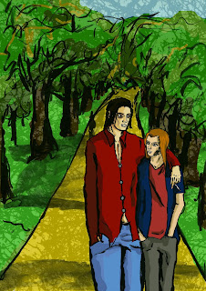
For a lot of the pages I had trouble not using panels, so I did use them but made them sort of part of the background. This is mainly for the scenes in the park where most of the scenes were naturally framed by trees already. I went with this and framed the pages and panels with branches of trees which helped the page link together and become one image.

Looking at my pen and ink A4 versions and my A3 ink versions I think the A3 versions are stronger as they obviously develop from the A4 version and there are the advantages in drawing with ink that I talked about in an earlier post. I can however get a wider range of textures with pen so I may work into my ink pieces with pen to get a bit of range of texture.

Saturday, 2 May 2015

As part of my outside of uni projects I've been submitting work to Stamp Press as a freelance designer. You can find my designs at Stamp Press, I only have a few at the moment but am going to continue submitting designs. The good thing about doing these designs is I can pretty much draw what I want however there are quite a few rules I have to follow such as only using original work and not copying from photos with any sort of copyright. There are also a lot of rules for how to format the image before submitting which can be a pain.
I've started by submitting drawings which I had done in a way that I knew would definitely be able to turn into a print, using solid lines and not getting into too much detail. I will explore a variety of styles however and see how far I can go with some styles while still having them be able to become a print.

Thursday, 30 April 2015

Are You My Mother, Alison Bechdel

I was in Waterstones over Easter looking through their graphic novel section like I usually do and being for the large part unimpressed by the art style of most of the comics like I usually am. I did come across one Graphic Novel which's art style caught my eye and I really liked. That book was 'Are You My Mother' by AlisonBechdel. The art style is relatively simple and I'm pretty sure is drawn with ink just like how I've been working. I assume she's used a dip pen or something similar instead of a brush (like I am) because there is a lot of precision in the line work which can get quite fine at times as well. I really like the tonal work which is dome using various shades of ink. I like this because it means the tones aren't flat, you get slight variances and textures throughout the toned area which just makes the images more visually interesting while keeping them simple as well. There are other things in this comic I really like visually like how the panels aren't rigidly ruled out straight. They appear to be drawn freehand and I just really like the uniqueness of this lay out.
One of the main reasons I think this style works so well is that it is obviously hand drawn and so you never forget about the art or the fact that someone has drawn this. At the same time the art is skillful and it doesn't draw you out of the story but you still appreciate and notice the art which doesn't seem to happen in a lot of mainstream comics these days.


Packhorse exhibition

I had to do a bit of writing about my work for The Packhorse gallery

My work primarily explores depressions but the aspects I focus on can apply to many forms of mental illness. My work depicts people in various everyday situations with nothing out of the ordinary. The only exception to this is the creature that clings to one figure in each drawing. The creature represents depression and the personification of it in my art is the only clue the person is unwell. Other than the creature the person seems like any other mentally healthy person. This shows how anyone can suffer from mental illnesses and just because someone seems fine doesn't mean they aren't in a constant struggle. The creature varies in size throughout my work showing how depression sometimes affects you just a little, in ways you can deal with but sometimes it overwhelms you and there is not fighting it. I've used a variation of ink, pen and negative space throughout my series of work to try and convey the way depression must affect the person and their perception of the world at times when it is overwhelming or relatively dormant. 

Wednesday, 29 April 2015

J.H Williams III

 J.H Williams III is a comic book artist known for his work on Batwoman and his more recent work on Sandman Overture through which I discovered him. Again I got a bit lucky by stumbling upon a comic book illustrator who lays out his pages in a similar way I want to. I remembered a few comics I've read before where some pages have been laid out in a kind of panel-less one image sort of way but none were done with the skill or frequency as Williams' pages are.

Williams lays out seemingly all his pages in some kind of unique way, different from the usual rectangular, linear panels you usually get in comics, He often uses panels but the background is used to shape them so they seem to more naturally be part of the page and weave the page together.

Tuesday, 28 April 2015


I had been leaning towards the comic angle for doing this project for a while. I started originally by approaching the comic with the idea of doing each panel individually, sort of as a fully formed piece of art and then stitching the panels together on Photoshop to create the page. I was having a lot of trouble doing this. I never quite knew if one panel was finished and how much of the page I had done, it became very confusing and quite overwhelming.
One day I was looking through my memory stick for piece of work to play with on Photoshop when I came across the scans of the pages I did for my comic last year. I remembered how much more motivated I was for that project and how much simpler it was to create those pages. I realised I had to change my approach this comic concept from another angle. Almost straight away I drew up a page for my story using my storyboard thingy to plan out the panels. I drew the page in pen in a scratchy quick manner. This is partly to reflect the similar style I used for my comic last year but also because drawing this page was more of an exercise to get me thinking about the best way to approach making these pages.

It was a bit of a coincidence and partly down to not having a ruler handy but while penciling the figures into the spaces I knew the panels would be I realised that I could relatively simply get the images in my panels to merge together or flow into each other, essentially I could make an almost panel-less comic book page. I liked this idea a lot. After penning the page I used ink to accentuate the flow of the panels and try to make the page almost one image.
When I was halfway through this process and penning the figures, James came and had a look at my work. James knows a lot about comics so was quite helpful. He told me there were problems with this page specifically my panel lay out and the angles I've used break continuity and would break the immersion of the reader. I see what he's saying as I wasn't really thinking about that when drawing the page having just copied the panels over from my storyboard. I think James was a bit harsh in how much he said it effected the page as I know quite a few comics (Locas, Saga) which have some similar changes in angles and such but I think it may just be a difference in comic background. He still had a point though.

James also seemed to prefer my ink work to pen work. I pretty much agree with this assessment. I think it's because I'm not using reference material very much in this project meaning I'm making a lot of little mistakes in things like proportion. In pen this can come across as just seeming like mistakes (although I think often it works along with my style to create a unique and cool aesthetic) but with ink due to the loose nature of the medium it seems just more stylistic and is less noticeable.

This lead me to the conclusion that I need to make full comic pages using ink and a layout that leads the images into each other and makes the page look like a singular artistic entity rather than many images cobbled together.