Sunday, 7 December 2014

I began this project by researching a range of British subcultures, how they linked together and if they were routed in a certain class. I made a lot of spider diagrams and rough timelines to try and organise my thoughts and figure out how everything fitted together. Despite focusing on British youth movements I did touch on a few American movements that influenced various British teens. 

The timeline I developed went like this: 
Hipster ( late 1940's)- The original hipsters were generally middle class Americans who adopted the lifestyle of black jazz musicians. One key feature of this was 'self imposed poverty'
Beat (1950's)- Again middle class Americans who rejected the perceived notions of the middle class and lived a bohemian like counter culture lifestyle. Liked cafes
Teddy Boy (1950's)- The first British teen youth group. Routed in working class they sometimes formed gangs and rioted. Initially associated with jazz then later rock & roll.
Rocker (late 50's)- Working class bikers, known as outsider loners who rebelled against society.(The Wild One). Liked cafes
Mod (1960's)- Originally a middle class British extension of Beat cafe modern jazz culture or originally a small group of working class fashion orientated men who wanted clothes in a certain European influenced style. Mods aspired for the sophistication of middle class culture regardless of cultures. The working class 'hard mods' emulated rude boy West Indian culture as they came from the same impoverished areas of London and could be said to be more Teddy boy than Beat influenced. Mods were famously in conflict with rockers (somewhat routed in class). Liked cafes
Hippie (late 60's)- Hippies were middle class routed and lead a similar bohemian Lifestyle to Beats and the name comes from Hipster. Like Beats they rejected middle class values.
Skinhead (late 60's)- Skinheads came from the working class sector of mod culture. They shaved there heads as it was needed for factory work and better in fights (both working class associated), it also differentiated them from the middle class hippie movement. They couldn't afford to keep up with the fashion of richer mods and became a subculture when first wave mod died out.
Glam (1970's) Middle class based. Continued the middle class youth movement pattern of getting rid of gender boundaries (hippies and mods also did this) through fashion and make up
Punk (late 70's) Punk started as a way to oppose the 'affluent' pop music of the time, in that sense it has working class routes. Punk doesn't appear to have a preference to the working or middle class initially though. It embraced and was embraced by both classes and there was a unity between the two. There is a lot of information about punk and I've barely scratched the surface.
New Romantic (late 70's, 80's)- Middle class routed, evolved from glam. They had a working class equivalent - soul boys
Punk factions (1980's)- As punk developed it diversified into a multitude of sub-genres such as:
    Glam Punk- middle class based, from glam, ;inked with New Romantics
    Hardcore- Mainly middle class (especially the bands) but like other M-class cultures they rebelled                        against the current values of the class and dressed very W class. A lot were straight-                            edge.
    Oi & Street Punk- both working class. Developed because current punk was deemed pretentious                                       and student based. Many skinheads became part of the Oi pink scene.
    Hatecore punk- Oi punk is often confused with this. Think racist skinhead punk.
Goth (1980's)- Middle class offshoot of punk, coexisted and conflicted with punks and New Romantics
Brit pop (1990's)- More of a class driven sub-genre than subculture. The music mainly revolved around M-class culture but had followers of both class. Blur were seen as M and Oasis as W. There was a lot about creating a less androgynous scene than earlier subcultures. 
Emo (2000's)- A very modern subculture mainly middle class and pretty androgynous.
Chav (2000's)- Working class routed, like modern day skin heads (not aesthetically). Middle class versions did appear, trying to emulate a working class lifestyle.
Hipster (2010's) Current. Middle class. A lot like original hipsters. A sort of faux poverty. Against the mainstream. Ill defined because so current. Like Cafes.

That's all the cultures. This is such a big subject and there's so much information and a lot of it disagrees and argues with each other but what I've written hear is what I'm going with.  I'll write more about what this means and stuff later. For now I'm a bit exhausted. 


Monday, 1 December 2014


I haven't really posted much this project (partly down to me and partly because I had limited internet for a while). Anyway my project is starting by looking at subcultures throughout the ages in Britain and how those cultures are routed in class. Here is a Mod based piece I hand drew and then edited on Photoshop and Microsoft Picture editor to put the 'mod symbol' over. Mod's were both middle and working class and there are arguments for them originating from either class. Of course a lot of the working class mods went on to become Skinheads, this was partly due to factory work requiring short hair and long hair being unsuitable for fights. Middle class mods could grow their hair and became known as Suede heads.
 

Narratives of Taste, Culture and Class

The new project revolves around culture, taste and class. To get started on such a large and broad topic I watched the Greyson Perry TV series 'In the best possible taste' and went to  his exhibition'The Vanity of Small Differences' in Temple Newsam House, a stately home. The exhibition showed the 6 tapestries Perry made that were informed by his exploration of class in the TV show. The tapestries were so intricately detailed with minutiae that you could actually get a lot of information about each class just from studying the tapestries.  From the tapestries you don't get a sense that Greyson favours one over the other but more that he is mocking all of them and the whole system. The whole thing gave me a lot to think about in terms of Culture, Taste and Class and how they are all linked.

Monday, 10 November 2014

Here's a piece of writing I did now that this project is all but over

I had a lot of trouble at the start of this project. I’m really not interested in drawing buildings and the three sites we were given I found either tedious to draw or just not interesting. This presented a challenge to the way I work. I started just drawing the most interesting of the sites, the train station, but even though I tried different approaches I felt like my work had no meaning or direction and I was really forcing myself to do work.  I felt like all this was having a negative effect on my project so quickly came up with a way to give the work direction. I did this by incorporating a figurative element to my work but feel that I may have sacrificed a certain amount of focus on the sites themselves by doing this and maybe I fell into my comfort zone when I could have tried to explore new techniques and options for dealing with the issues I had. Despite this I do believe the quality of my work and my attitude to the project increased when I gave it a more solid direction that I was interested in. I believe I made a good foundation of work with a clear development. 

The main issue I have with my work this project is maybe I didn’t do enough of the initial survey step and could have developed more site oriented ideas or tried more options than the figurative one I went with. I also feel I could have done more work with materials I’m not so familiar with on a wider variety of materials as well. For instance I would have liked to do some digital work which I never really do. However I never did so partly because my lack of experience in the area stopped me as I didn’t know what I could do or how. I need to develop the way I approach concepts that are completely new to me like this in the future otherwise my practice will not develop to the extent that it should. While I like the work I have done this project and especially the way I started incorporating colour it is very similar to my usual work in material and style. This isn't necessarily a problem but I do need to explore a little more.  I do like how I developed using colour in my work and using different type of line however. I am also pleased with the general concept of the project.


 When I did the building inside this figure I was influenced in the way I use colour from these two pieces from the initial survey portion of the project.


I also really like the tiny train station on a piece of cardboard. This was from some initial playing with scale.
 Here is my work on the wall ready to be exhibited for assessment. I had a limited amount of space and a lot of work I wanted to stick up. On top of that I wanted it to be at least somewhat chronological. In the end I had to just put pieces where they'd fit but you can see the general stages of development, the change of scale, the introduction of colour, changes in the production of line etc. That beam is really annoying though.


Here are a few of the photos I took at the Train Station, focusing more on the people there


Here are some photos I took of Queen's st. market and the library, the two sites I didn't use


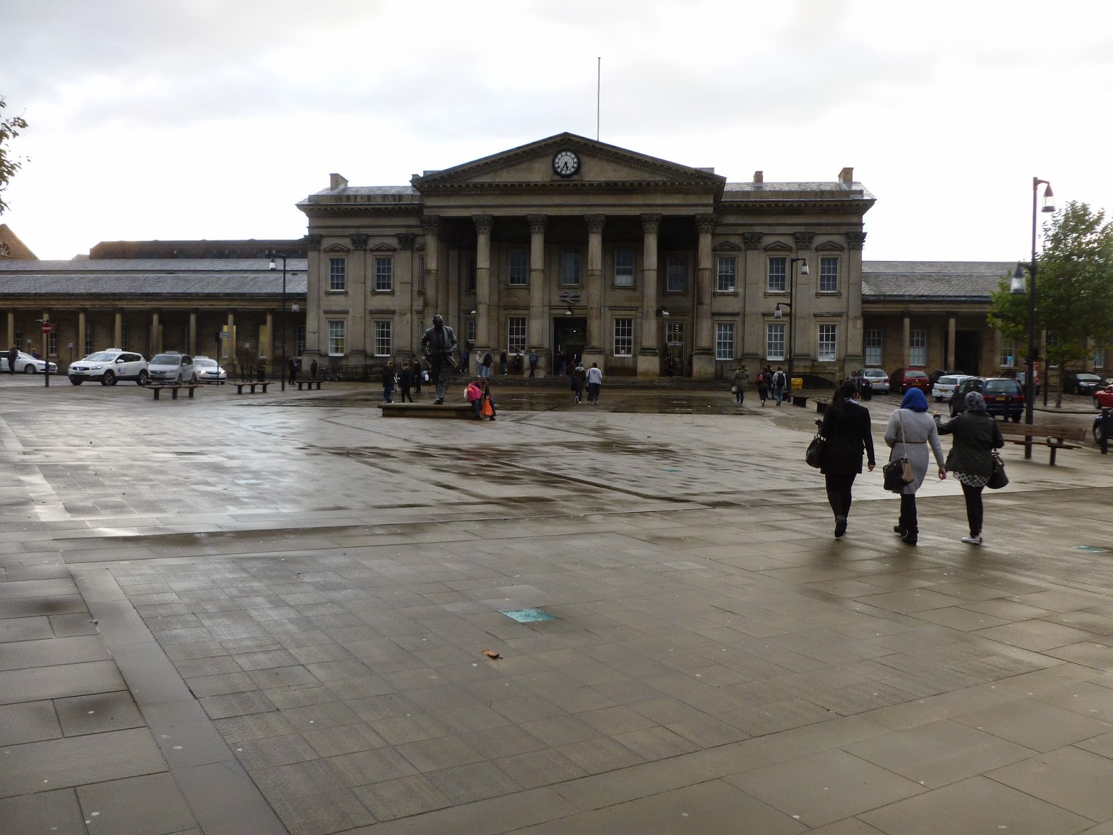
Here are just a few examples of photos I took of the Train Station


Saturday, 8 November 2014

For my big group drawing I encountered a lot of problems. The first was trying to find a suitable picture of a group of people, most of whom are touching in some way. This was actually quite hard to get and most of the photos I had that fit my criteria were blurry. I went ahead with one of the blurry photos anyway because I've done drawings from photos like that before and confident I could make it work.
I did the piece on some strange textured, canvasy paper because it was the only kind of paper I could get at the time which was anywhere near the size I wanted and I wanted to start on it immediately. I realise now I should have done a few quick practice pieces on this paper that was new to me. I projected the picture of the figures up and traced them on with graphite. After I was finished I inked the figures with a brush and black ink. I found that this type of paper was actually really good for brush and ink work. The textured nature of the paper makes it good for holding ink and easily getting different tones. At the time I was actually worried that I'd worked into the figures too much.

I then projected a picture of the train station onto the figures and traced over the portion of the picture which overlapped the figures. I tried a few different photos at different sizes and chose which one fit best. I chose the photo below as I thought it filled each figure pleasantly and in a way that would capture your interest.

I had trouble when it came to penning the building. The fine liner type pens I usually use for this job didn't really work on the textured paper so I had to use a thicker bolder pen. I thought this still might work since I'd used this pen with inked figures earlier in the project. It came apparent though that the building was strongly overpowering the figures. This was particularly bad because the drawing of the building wasn't very good itself. I used a projector and ruler for this drawing to get the structure solid feel of the building but my inexperience of using both was showing.

On top of everything the pens were running out. I finished the main group of linked figures and decided to take a different approach for the two left. I didn't see the point in continuing a failing system. I switched to using sharpies (a different colour for each figure. This is something I had tried for a different piece but I thought would make this drawing too full on and the building too powerful. I also followed the penciled projection less strictly going back to more of a loose instinct type drawing but still with a ruler. I think this technique worked better but still the quality of the drawing itself isn't that great and doesn't work as well as some of my previous work.
I still have to add the bits of colour to the black and white figures. I don't know if it will work very well with them being so full and ill defined but I might as well try it as I've already messed them up and it might actually make the image better. Something I have to think about is do I add the supporting colour to the two figure who already have colour in them? I did to a previous piece I did with colour but that one was full of colour already. It did work really well and created a great visual impact though. I think I might. It would link the two to the other group more as well. 


Saturday, 1 November 2014

Here are some experiments with colour for movement and energy and different types of line. I felt like using a ruler for the straight edges of the building gave it a really solid structural look but using a thicker pen than usual might have made it a bit overpowering. I also used ink to try and give the figure a more organic feel and to widen the gap between the line used for the figure and the building. I originally tried this without penciling the figure first but thought this compromised the quality of the drawing too much so then tried it with pencil first and think that works better. I don't think that the use of colour for the first image is that effective either, it may be too dark and not loose enough. For the next image though I really like the trailing brush strokes, especially those around the feet as I think it adds a great sense of movement. I think I'll stick to just them for moving people. I really like how this all looked combined with the building being drawn in colour to as it just made the whole image so vibrant and lively. I don't know if that's what I want from the drawing of the building though. Maybe I'll tone the colour work down a bit and see how it works then.


I was talking about the way I'm using line with Ian the other day. The issue with line in my current work is I essentially use the same type of line for everything in my work. This is because I like my natural sketchy line as I think it makes work more interesting and is different to the usual type of line you see in most art. There are some problems with it though and trying to get a difference between the figure and the building in my work is one of them. Ian suggested I look at Patrick Caulfield as an example of someone who uses a completely different kind of line, solid, definite and straight. I would have a lot of trouble drawing a line like this usually as I have shaky hands that make it hard to draw a continuous solid line and keep control (it does give me my natural drawing style which I prefer though). This means to get lines like Caulfield's (or maps which we also looked at the use of line in) I'll have to use a ruler. If I do this for the building on the inside but draw the people free hand then hopefully that should give a big enough difference in line.
(source: http://standpointmag.co.uk/files/u28/Art---Prodger.jpg)

Veronica Lawlor is an artist Gill told me to look at when it came to thinking of ways to add colour to my work that will work with my concept. The main thing I get from her work is using colour as a type of line and as as a tool to add liveliness and energy to a piece when appropriate, such as the piece to the right which needs some vibrance because it's time square. By toning down some of the ways in which she uses colour I can apply it to my own work to give a sense of life to my figures while keeping a nice balance with the building within them. I'm going to adapt this style by going over the lines of the figures I draw with multiple loose colours probably with gouache or maybe ink. (source: http://www.gallerynucleus.com/assets/attachments_p/000/019/544/size500_Times-Square-Lawlor.jpg
This was my first piece on a larger scale for this project. The other day Gill said it looked almost like a statue. I didn't think this originally but since she said it I think it looks more like a statue every time I see it. This isn't necessarily a bad thing but I would like there to be more of a contrast between the organicness of the figure and the structure of the building. I am already making progress on this with my work since however.


In this next piece I experimented around with quite a few different ideas. First of I drew the figure in blue not black to give the  figure and building another degree of separation.I then decided to draw the building with ink instead of pen, and I didn't sketch the drawing out like I usually do this time to try and get a much looser marker then usual. Finally I added a few dry brush strokes to give the piece a hint of colour in a similar but more subtle way to some of Veronica Lawlor's work. I thought the end result showed a clear difference between the figure and building although the figure may be a bit overpowered by the boldness of the ink. I like the effect the green brushstrokes have as well. They give the otherwise lifeless figure a bit of energy a sort of potential for movement. What I don't like so much is how rigid the figure is compared to the looseness of the building. It seems like it should be the other way round.


Here is the 'crowd' scene I drew that I talked about in my last post. I think each group of people look good on their own but as a whole piece it doesn't really work because of all the empty space and the awkward positioning of the groups in relation to each other. I was talking about my issues with this piece with Gill and she thinks the piece may be saved if I add another figure or two on the right hand side but more in the foreground this time or alternatively if I crop the right hand side to end at the last figure to form a more obvious sort of wedge shape with the figures and thus give  some reason as to why the figures are in such seemingly weird and awkward positions on the page.
If neither of these ideas work I may try some sort of abstract background and if that doesn't work I may cut the groups out to play around with in other ways. I also just wanted to say that I really like the central 3 figures and how they work with the building inside them.

Thursday, 30 October 2014

I've been working and experimenting  on a bigger scale recently while still trying to get a decent balance between the figure and the building and playing around with different kinds of line
One of the problems I've encountered with doing a crowd scene however is that you have to get the proportions and shape of each figure pretty much perfect as a mistake will have a knock on effect which can lead to a figure later having some very noticeable mistakes in their positions or proportions. This means if I were to move on to an even larger scale (which I plan to) I would probably have to use a projector as on a larger scale the effects of slight effects would be even more noticeable and it would be harder to get prefect proportions on a large scale.
This isn't a problem so much when there is only a single figure though or even if there's just a small group. I may do a small  group on a larger scale as there are a lot of issues with doing a larger crowd. The main problem is I can't get a decent picture of a cohesive crowd at the train station. I've took pictures and observed the building at various times of the day, especially between 5 and 6 when I thought a large amount of people would be returning from work. I've never found a large crowd around the station though. I can only ever get photos of people in sparse groups spaced out outside the station. When I try to turn these into drawings however the figures look odd without a background like they are just hanging in space. The lack of a background isn't really an issue in single figures or even groups if the people are somewhat evenly distributed and touching but without a background a sparse crowd just looks odd.
I have been thinking of ways of putting in a sort of background to this kind of work but so far there is nothing that's working to well.

Saturday, 18 October 2014

I've been pursuing the drawings of buildings in people idea I had. I've tried using colour in the work by colouring the figures but in a way so that you can still see the building in the figure. I prefer the black & white work though as it keeps a better balance between the picture being of the figure and of the building. This balance is very important to my work at the moment as I don't want it to be primarily about one over the other.
I've experimented with keeping bits of the figure blank from the drawing of the building eg. for one drawing I drew the building inside all of the figure except it's skin. I didn't think this was an improvement on the original idea though as it took away too much from the drawing of the building which became too fragmented.
I'm also finding the amount of detail put into the figure is important as is the kind of line I use to draw it as apposed to the building, I'm currently playing around with these concepts but am als planning to start working on a larger scale and with crowds of people (I've already started experimenting with two figures).

While doing this I'm still trying to do some surveying and creative exploration of the sites themselves (mainly the train station) as the project is mainly about these and I feel I may have rushed into an idea too fast. I find tracing paper is very useful for this project as it allows you to experiment with layering things and saves me from the tedious task of having to draw the building freehand if I just need a quick drawing to test something.

Friday, 10 October 2014

I realised that the work of Marco Zamora must have influenced my idea of drawing buildings within people. Marco Zamora is an artist I've liked for a while. While working on my latest drawing I got reminded of his work. Zamora has a lot of work where he combines buildings with his figures, often he places the buildings on the outside of the figures but he also occasionally works them into the figure as well. It's not like my current approach but does suggest different ways of doing a similar thing.
After a few days of drawing the same buildings over and over again I started to feel a bit of a pointlessness and lack of direction to my work. To combat this I wondered if I would feel differently about my work if I bought figure into it a bit as that is the kind of art I like to do most. I did a few ordinary drawings of people around the train station but had similar issues with the work.

I then had the idea of drawing the outline of people in my photos and then drawing the train station within the outline. To the left is my first piece doing this. I really liked the effect of this and am going to continue exploring this general idea.
I like how the emptiness of the space outside the figure contrasts with inside the figure which is full of information. I also like to think of the figure as a sort of window, one of my course mates said that because the figure is moving it makes you feel like the inside should be moving as well, think looking at buildings outside of a moving car window. I also like the obvious switch of a building being inside a person when usually a person is inside a building.

Thursday, 9 October 2014

Originally to try and cope with the amount of architecture needing to be drawn in this project I needed some kind of tactic to make drawing buildings more bearable to do this I looked at a variety of artists who had made drawing of buildings but not in a repetitive or structured way.

John Piper was one of these artists. (http://www.tate.org.uk/art/artworks/piper-title-not-known-p05054) He keeps a very rough look to his work which is bold but dark so not too overbearing. I like his use of interesting angles and perspectives (something I could easily apply to my work) especially in his work on Venice. His work also seems surprisingly detailed once you have a look at t but the detail is done in a rough almost gestural way so that it doesn't seem as repetitive as most buildings.


Lucinda Rogers: (http://www.lucindarogers.co.uk/images/london/large/lucinda-rogers-London-Bridge-and-Saint-Magnus-the-Martyr.jpg)
I love Lucinda Rogers' use of line. The contract of the really thick lines and the delicate thin lines makes her work very interesting despite its relatively simplicity. Her work has a bold graphic quality to it which appeals to me and I like the muted use of tone, how she's only used slight grey washes on little bits of the drawing. Her use of line is very strong and definite though which is something that I could try but usually have a lot of trouble with (shaky hands) I should try using a bugger variety of lines though (by using different pens) but usually I get too absorbed in the drawing process and forget to vary the pens I use. I'll keep a conscious effort not to do that in the future.

David Gentleman (http://www.lucindarogers.co.uk/images/london/large/lucinda-rogers-London-Bridge-and-Saint-Magnus-the-Martyr.jpg)
I find something very normal about Gentleman's work. This also means I find it boring. I can't really think of why I feel this way except that it's the kind of thing I would expect someone to do if I told them to do an 'normal' drawing of a place. There are still aspects of his work that I like however like the use of line on parts of the clothing of the people and I can still take away tips for drawing buildings. His use of line for the building isn't incredibly solid like you'd expect for a building (none of these artists have used that sort of line really) and he's gone for more of a nod to the detail of the stone work than actually drawing every repetitive bit in himself. A lot of his lines also cross over making it easier to keep track with where everything is and speeding up the whole process. While typing I think I've figured out more about why I find his work boring and that is that it is just the wrong mixture of sketchy and clean cut, if it were a bit more of either one I think I would like it more.


Valery Koshlyakov (http://lecercledartaucailar.blogs.com/photos/le_cailar_2005/dtailkoshlyakov2.jpg)

I saw Valery's work at the Saatchi a few years ago and loved it because of all the dripping lines and general messiness of the work yet it still being a very good painting of a building at the same time. I always think his work is like looking at the buildings in the rain because of all the bripping paint. Nothing about his work even attempts to be absolutely perfect or rigid. Windows don't line up, lines aren't always even or parallel yet the style he works in means this doesn't matter and on first look it looks like he's got it all very uniform considering the nature of the work. There is still a lot of repetitiveness in his work yet I don't get the sense that he agonised over making sure that two windows were exactly the same or anything.

Saturday, 4 October 2014

To start the drawing project we have been given 3 sited in Huddersfield: the Train Station, The Library and Queensgate Market. I'm not very keen on this starting point as I find buildings very boring and tedious to draw as they are usually (and the ones given) very repetitive and symmetrical so your first few seconds of drawing are a lot like the rest of them. The project briefing puts a strong emphasis on the building itself so there isn't really a way to get away with not drawing them. This offers me an interesting challenge of how to get around the repetitiveness in drawing a building.

The one thing I do like about drawing buildings however is the interesting yet obvious perspectives you can get from certain angles, I think this might be what I start focusing on after I finish initial surveying and observation stages of the sites.
I will also try and incorporate figurative drawings into my work as well as that is at the core of my practice as an illustrator and all places are made for people and nothing without them.

Year 2

From now on  all my new posts follow year 2 starting with the module Studio Practice 3, Drawing.

Monday, 5 May 2014


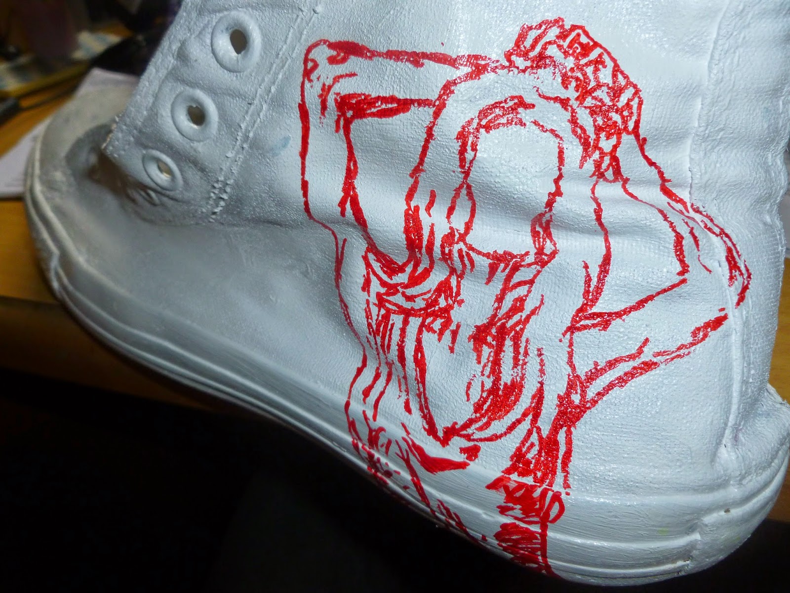
I had a pair of old shoes that didn't work anymore so I decided to paint them white and draw on them. I painted them with acrylic since that's all I had. I didn't really draw on them for any other reason than it was something to do with them  but it it was useful practicing more with sharpies and making use of their 'draw on anything' quality by working on a different kind of surface. I once again didn't give the figures faces for no other reason than at the moment I like how that looks.