Monday, 10 November 2014

Here's a piece of writing I did now that this project is all but over

I had a lot of trouble at the start of this project. I’m really not interested in drawing buildings and the three sites we were given I found either tedious to draw or just not interesting. This presented a challenge to the way I work. I started just drawing the most interesting of the sites, the train station, but even though I tried different approaches I felt like my work had no meaning or direction and I was really forcing myself to do work.  I felt like all this was having a negative effect on my project so quickly came up with a way to give the work direction. I did this by incorporating a figurative element to my work but feel that I may have sacrificed a certain amount of focus on the sites themselves by doing this and maybe I fell into my comfort zone when I could have tried to explore new techniques and options for dealing with the issues I had. Despite this I do believe the quality of my work and my attitude to the project increased when I gave it a more solid direction that I was interested in. I believe I made a good foundation of work with a clear development. 

The main issue I have with my work this project is maybe I didn’t do enough of the initial survey step and could have developed more site oriented ideas or tried more options than the figurative one I went with. I also feel I could have done more work with materials I’m not so familiar with on a wider variety of materials as well. For instance I would have liked to do some digital work which I never really do. However I never did so partly because my lack of experience in the area stopped me as I didn’t know what I could do or how. I need to develop the way I approach concepts that are completely new to me like this in the future otherwise my practice will not develop to the extent that it should. While I like the work I have done this project and especially the way I started incorporating colour it is very similar to my usual work in material and style. This isn't necessarily a problem but I do need to explore a little more.  I do like how I developed using colour in my work and using different type of line however. I am also pleased with the general concept of the project.


 When I did the building inside this figure I was influenced in the way I use colour from these two pieces from the initial survey portion of the project.


I also really like the tiny train station on a piece of cardboard. This was from some initial playing with scale.
 Here is my work on the wall ready to be exhibited for assessment. I had a limited amount of space and a lot of work I wanted to stick up. On top of that I wanted it to be at least somewhat chronological. In the end I had to just put pieces where they'd fit but you can see the general stages of development, the change of scale, the introduction of colour, changes in the production of line etc. That beam is really annoying though.


Here are a few of the photos I took at the Train Station, focusing more on the people there


Here are some photos I took of Queen's st. market and the library, the two sites I didn't use


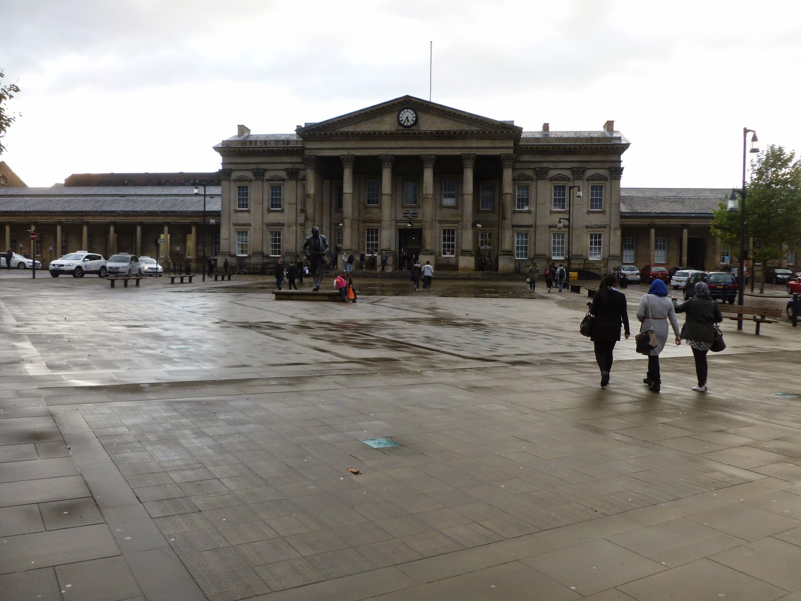
Here are just a few examples of photos I took of the Train Station


Saturday, 8 November 2014

For my big group drawing I encountered a lot of problems. The first was trying to find a suitable picture of a group of people, most of whom are touching in some way. This was actually quite hard to get and most of the photos I had that fit my criteria were blurry. I went ahead with one of the blurry photos anyway because I've done drawings from photos like that before and confident I could make it work.
I did the piece on some strange textured, canvasy paper because it was the only kind of paper I could get at the time which was anywhere near the size I wanted and I wanted to start on it immediately. I realise now I should have done a few quick practice pieces on this paper that was new to me. I projected the picture of the figures up and traced them on with graphite. After I was finished I inked the figures with a brush and black ink. I found that this type of paper was actually really good for brush and ink work. The textured nature of the paper makes it good for holding ink and easily getting different tones. At the time I was actually worried that I'd worked into the figures too much.

I then projected a picture of the train station onto the figures and traced over the portion of the picture which overlapped the figures. I tried a few different photos at different sizes and chose which one fit best. I chose the photo below as I thought it filled each figure pleasantly and in a way that would capture your interest.

I had trouble when it came to penning the building. The fine liner type pens I usually use for this job didn't really work on the textured paper so I had to use a thicker bolder pen. I thought this still might work since I'd used this pen with inked figures earlier in the project. It came apparent though that the building was strongly overpowering the figures. This was particularly bad because the drawing of the building wasn't very good itself. I used a projector and ruler for this drawing to get the structure solid feel of the building but my inexperience of using both was showing.

On top of everything the pens were running out. I finished the main group of linked figures and decided to take a different approach for the two left. I didn't see the point in continuing a failing system. I switched to using sharpies (a different colour for each figure. This is something I had tried for a different piece but I thought would make this drawing too full on and the building too powerful. I also followed the penciled projection less strictly going back to more of a loose instinct type drawing but still with a ruler. I think this technique worked better but still the quality of the drawing itself isn't that great and doesn't work as well as some of my previous work.
I still have to add the bits of colour to the black and white figures. I don't know if it will work very well with them being so full and ill defined but I might as well try it as I've already messed them up and it might actually make the image better. Something I have to think about is do I add the supporting colour to the two figure who already have colour in them? I did to a previous piece I did with colour but that one was full of colour already. It did work really well and created a great visual impact though. I think I might. It would link the two to the other group more as well. 


Saturday, 1 November 2014

Here are some experiments with colour for movement and energy and different types of line. I felt like using a ruler for the straight edges of the building gave it a really solid structural look but using a thicker pen than usual might have made it a bit overpowering. I also used ink to try and give the figure a more organic feel and to widen the gap between the line used for the figure and the building. I originally tried this without penciling the figure first but thought this compromised the quality of the drawing too much so then tried it with pencil first and think that works better. I don't think that the use of colour for the first image is that effective either, it may be too dark and not loose enough. For the next image though I really like the trailing brush strokes, especially those around the feet as I think it adds a great sense of movement. I think I'll stick to just them for moving people. I really like how this all looked combined with the building being drawn in colour to as it just made the whole image so vibrant and lively. I don't know if that's what I want from the drawing of the building though. Maybe I'll tone the colour work down a bit and see how it works then.


I was talking about the way I'm using line with Ian the other day. The issue with line in my current work is I essentially use the same type of line for everything in my work. This is because I like my natural sketchy line as I think it makes work more interesting and is different to the usual type of line you see in most art. There are some problems with it though and trying to get a difference between the figure and the building in my work is one of them. Ian suggested I look at Patrick Caulfield as an example of someone who uses a completely different kind of line, solid, definite and straight. I would have a lot of trouble drawing a line like this usually as I have shaky hands that make it hard to draw a continuous solid line and keep control (it does give me my natural drawing style which I prefer though). This means to get lines like Caulfield's (or maps which we also looked at the use of line in) I'll have to use a ruler. If I do this for the building on the inside but draw the people free hand then hopefully that should give a big enough difference in line.
(source: http://standpointmag.co.uk/files/u28/Art---Prodger.jpg)

Veronica Lawlor is an artist Gill told me to look at when it came to thinking of ways to add colour to my work that will work with my concept. The main thing I get from her work is using colour as a type of line and as as a tool to add liveliness and energy to a piece when appropriate, such as the piece to the right which needs some vibrance because it's time square. By toning down some of the ways in which she uses colour I can apply it to my own work to give a sense of life to my figures while keeping a nice balance with the building within them. I'm going to adapt this style by going over the lines of the figures I draw with multiple loose colours probably with gouache or maybe ink. (source: http://www.gallerynucleus.com/assets/attachments_p/000/019/544/size500_Times-Square-Lawlor.jpg
This was my first piece on a larger scale for this project. The other day Gill said it looked almost like a statue. I didn't think this originally but since she said it I think it looks more like a statue every time I see it. This isn't necessarily a bad thing but I would like there to be more of a contrast between the organicness of the figure and the structure of the building. I am already making progress on this with my work since however.


In this next piece I experimented around with quite a few different ideas. First of I drew the figure in blue not black to give the  figure and building another degree of separation.I then decided to draw the building with ink instead of pen, and I didn't sketch the drawing out like I usually do this time to try and get a much looser marker then usual. Finally I added a few dry brush strokes to give the piece a hint of colour in a similar but more subtle way to some of Veronica Lawlor's work. I thought the end result showed a clear difference between the figure and building although the figure may be a bit overpowered by the boldness of the ink. I like the effect the green brushstrokes have as well. They give the otherwise lifeless figure a bit of energy a sort of potential for movement. What I don't like so much is how rigid the figure is compared to the looseness of the building. It seems like it should be the other way round.


Here is the 'crowd' scene I drew that I talked about in my last post. I think each group of people look good on their own but as a whole piece it doesn't really work because of all the empty space and the awkward positioning of the groups in relation to each other. I was talking about my issues with this piece with Gill and she thinks the piece may be saved if I add another figure or two on the right hand side but more in the foreground this time or alternatively if I crop the right hand side to end at the last figure to form a more obvious sort of wedge shape with the figures and thus give  some reason as to why the figures are in such seemingly weird and awkward positions on the page.
If neither of these ideas work I may try some sort of abstract background and if that doesn't work I may cut the groups out to play around with in other ways. I also just wanted to say that I really like the central 3 figures and how they work with the building inside them.