One of the main reasons I think this style works so well is that it is obviously hand drawn and so you never forget about the art or the fact that someone has drawn this. At the same time the art is skillful and it doesn't draw you out of the story but you still appreciate and notice the art which doesn't seem to happen in a lot of mainstream comics these days.
Thursday, 30 April 2015
Are You My Mother, Alison Bechdel
I was in Waterstones over Easter looking through their graphic novel section like I usually do and being for the large part unimpressed by the art style of most of the comics like I usually am. I did come across one Graphic Novel which's art style caught my eye and I really liked. That book was 'Are You My Mother' by AlisonBechdel. The art style is relatively simple and I'm pretty sure is drawn with ink just like how I've been working. I assume she's used a dip pen or something similar instead of a brush (like I am) because there is a lot of precision in the line work which can get quite fine at times as well. I really like the tonal work which is dome using various shades of ink. I like this because it means the tones aren't flat, you get slight variances and textures throughout the toned area which just makes the images more visually interesting while keeping them simple as well. There are other things in this comic I really like visually like how the panels aren't rigidly ruled out straight. They appear to be drawn freehand and I just really like the uniqueness of this lay out.
One of the main reasons I think this style works so well is that it is obviously hand drawn and so you never forget about the art or the fact that someone has drawn this. At the same time the art is skillful and it doesn't draw you out of the story but you still appreciate and notice the art which doesn't seem to happen in a lot of mainstream comics these days.
Packhorse exhibition
I had to do a bit of writing about my work for The Packhorse gallery
My work primarily explores depressions but the aspects I
focus on can apply to many forms of mental illness. My work depicts people in
various everyday situations with nothing out of the ordinary. The only
exception to this is the creature that clings to one figure in each drawing.
The creature represents depression and the personification of it in my art is
the only clue the person is unwell. Other than the creature the person seems
like any other mentally healthy person. This shows how anyone can suffer from
mental illnesses and just because someone seems fine doesn't mean they aren't
in a constant struggle. The creature varies in size throughout my work showing
how depression sometimes affects you just a little, in ways you can deal with
but sometimes it overwhelms you and there is not fighting it. I've used a
variation of ink, pen and negative space throughout my series of work to try
and convey the way depression must affect the person and their perception of
the world at times when it is overwhelming or relatively dormant.
Wednesday, 29 April 2015
J.H Williams III
J.H Williams III is a comic book artist known for his work on Batwoman and his more recent work on Sandman Overture through which I discovered him. Again I got a bit lucky by stumbling upon a comic book illustrator who lays out his pages in a similar way I want to. I remembered a few comics I've read before where some pages have been laid out in a kind of panel-less one image sort of way but none were done with the skill or frequency as Williams' pages are.
Williams lays out seemingly all his pages in some kind of unique way, different from the usual rectangular, linear panels you usually get in comics, He often uses panels but the background is used to shape them so they seem to more naturally be part of the page and weave the page together.
Tuesday, 28 April 2015
I had been leaning towards the comic angle for doing this project for a while. I started originally by approaching the comic with the idea of doing each panel individually, sort of as a fully formed piece of art and then stitching the panels together on Photoshop to create the page. I was having a lot of trouble doing this. I never quite knew if one panel was finished and how much of the page I had done, it became very confusing and quite overwhelming.
One day I was looking through my memory stick for piece of work to play with on Photoshop when I came across the scans of the pages I did for my comic last year. I remembered how much more motivated I was for that project and how much simpler it was to create those pages. I realised I had to change my approach this comic concept from another angle. Almost straight away I drew up a page for my story using my storyboard thingy to plan out the panels. I drew the page in pen in a scratchy quick manner. This is partly to reflect the similar style I used for my comic last year but also because drawing this page was more of an exercise to get me thinking about the best way to approach making these pages.
It was a bit of a coincidence and partly down to not having a ruler handy but while penciling the figures into the spaces I knew the panels would be I realised that I could relatively simply get the images in my panels to merge together or flow into each other, essentially I could make an almost panel-less comic book page. I liked this idea a lot. After penning the page I used ink to accentuate the flow of the panels and try to make the page almost one image.
When I was halfway through this process and penning the figures, James came and had a look at my work. James knows a lot about comics so was quite helpful. He told me there were problems with this page specifically my panel lay out and the angles I've used break continuity and would break the immersion of the reader. I see what he's saying as I wasn't really thinking about that when drawing the page having just copied the panels over from my storyboard. I think James was a bit harsh in how much he said it effected the page as I know quite a few comics (Locas, Saga) which have some similar changes in angles and such but I think it may just be a difference in comic background. He still had a point though.
James also seemed to prefer my ink work to pen work. I pretty much agree with this assessment. I think it's because I'm not using reference material very much in this project meaning I'm making a lot of little mistakes in things like proportion. In pen this can come across as just seeming like mistakes (although I think often it works along with my style to create a unique and cool aesthetic) but with ink due to the loose nature of the medium it seems just more stylistic and is less noticeable.
This lead me to the conclusion that I need to make full comic pages using ink and a layout that leads the images into each other and makes the page look like a singular artistic entity rather than many images cobbled together.
Sunday, 26 April 2015
Utopia may have also changed the way I want to approach doing work for this project however. Utopia centers around a graphic novel and the way this graphic novel looks is pretty awesome.
You don't see much of it throughout the show but when you do it doesn't look like a typical comic at all. The way the pages are laid out in a way
where there doesn't seem to be any panels, the images sort of just flow into each other and every page looks like its own piece of art, not just because a lot of the pages seem to consist of only one image. In the show the comic is essentially the ramblings of a mad man and in a way this is the sort of look I would like for my work. Sort of, I want the kind of roughness and jumbled together look the comic has. A problem with this is it could be really hard to do with a coherent story. Utopia can succeed at this because this graphic novel isn't real, what we see doesn't have to make sense and we can just trust the characters that it does. Mine however, would have to make sense.
I looked at a lot of Wes Anderson films to find just what it is that makes them so visually interesting and unique. It seemed to be due to most shots being centered and there being a strong sense of symmetry. This site pretty much confirms these theories (although it's in french so you can't be sure). There also seem to be a lot of lines in Anderson's frames which break up the shot and frame certain aspects of it. The colour palette is quite vibrant compared to how dull most films' pallets are and when the palette is muted there is usually an atmospheric reason. I'm not planning on colouring my work though so this is beside the point.
I also looked at some Coen brother films. I focused on No Country For Old Men (2007) because it's one of my favourite films and I remember it being shot in some really cool ways.
It also centers a lot of the characters in the frame and has in frame framing like Anderson's films do. Some other things I'd say about Coen films though are that they like using the foreground, midground and background to make shots interesting. The brothers also often leave a lot space in their frames which is really effective, especially in films like Fargo (1996) where the surrounding environment plays such a key role. Anderson also uses a lot of space in his work but not usually to the extent that the Coens do. The colour palettes in most Coen films may not be as lively as in most of Anderson's but this doesn't matter so much as a strong sense of lighting and consistent tone of palette still keeps the frames interesting throughout.
I've also just realised while writing this that both directors often use bird's eye view shots in their films and they are almost always interesting.
A problem with translating what I've learned into my practice however is that film frames are always the same size and ratio while I would probably work with a variety of frame sizes and shapes if I were to do a comic. This means that not everything I've learnt can be applied to every panel but I should still be able to make most frames interesting by going back to what I've learned here.
Friday, 24 April 2015
I had a good talk with Jo (the kind of tutor not one of the many students by the same name). She looked at a lot of the scenes I had drawn/composed for my story and said a good way to develop/improve them. She suggested looking at films that are shot in interesting and effective ways. She suggested looking at films directed by people like the Cohen brothers, Darren Aronofsky or ones with a strong unique style like Wes Anderson. She also suggested thinking of any memorable cool shots from other films I can remember. This was really useful advice because when I story-boarded my narrative I thought of the transition between scenes like a film and thought about how the camera would move and what sort of shots would be best used. My background in media studies helped a lot with this.
Here are some of the initial shots that came to mind.
This is the best image of a shot from 'Requiem for a Dream' (2000) which happens to be directed by Aronofsky.
This is a shot from 'Eternal Sunshine of the Spotless Mind' (2004) directed by Michael Gondry. I'll talk more in depth about what makes a scene effective in a later post.
During this project I did quite a few more complete style pieces. This is just to vary up the project a bit and to see if any new paths might emerge from doing these. These generally emerged from character sketches that I liked that I wanted to develop in Photoshop. Another reason for doing work like this is it's an opportunity for me to practice Photoshop which is a skill I'm very much trying to develop. I've learnt a bit about colouring, adjusting levels and merging layers from fiddling about this project.
Tuesday, 21 April 2015
To the left you can see the piece I believe works best. I think the use of various grays in the background and the pure black and white characters differentiate the two layers enough while the use of ink for both layers prevents the two aspects from being two entirely different entities. This I think is a little the case for the piece below. Though I think this to works well the figures seam a little too stuck on compared to the first piece. A similar problem comes from the colour experiment I did as well. I doesn't have the synergistic relationship the first one has in which the foreground and background support each other to strengthen the whole.
I decided to draw certain scenes from my storyboard plan thing. I thought it would be interesting to draw the figures in ink with a brush, the way I drew most of my work last project. I tried doing the figure and background separately and then combining the two on Photoshop. This allowed me to try out a multitude of different types of background to see how they work out. The piece to the right and below to the left I don't think work because the characters merge in with the background too much due to a similar quality of line. The middle bellow one works better due to a variance of tone but the line quality is still very similar. The piece to the right does not have this problem. I attempted to create the background of this piece in Illustrator so the lines are very clean cut. Unfortunately I am not skilled enough at Illustrator to draw something as complex as a building in any adept way and the little bit I was able to do took me a very long time as it is. I was left not really sure how to get a good balance between the figures and background,
Monday, 20 April 2015
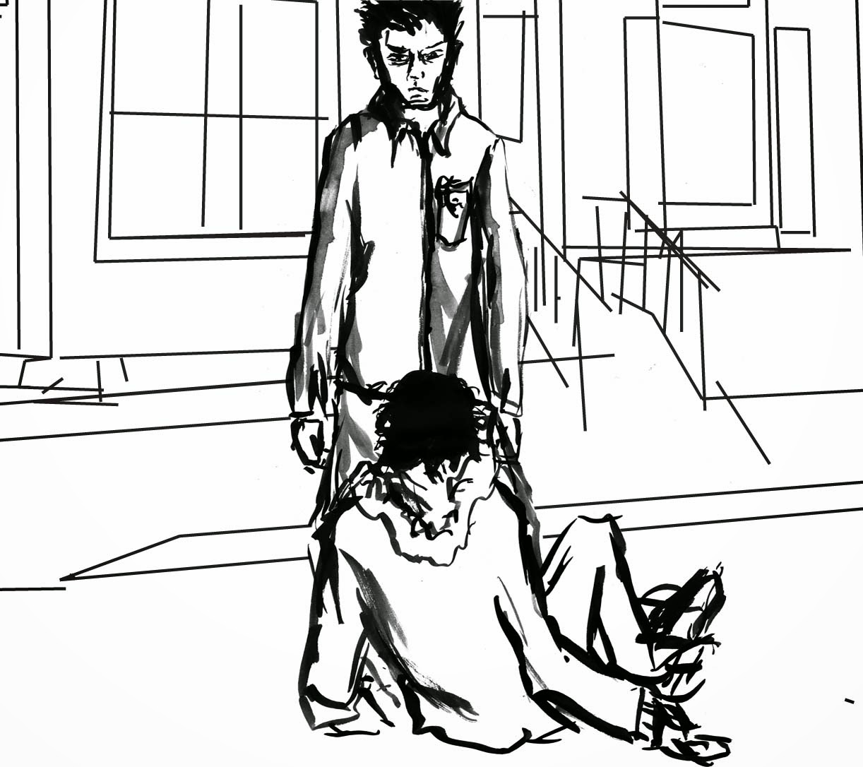
This is a sketch I did that I really like. I had been drawing street scenes for a while at the time but all from references. One day I wanted to draw the opening scene to my story and didn't have access to any of my reference material. Besides none of my references looked how I wanted the opening scene to look like. This lead to me drawing the scene from my head. My natural scratchy rough style combined with not basing the scene on a photo gave th drawing a really cool feel that I thought lent itself to the dark edgy tone I wanted for this scene. I guess the main problem with this scene is the area doesn't look that rough.
I think the buildings need to be taller and possibly more boring.
A cool side affect of this not being the case though is the street looks kind of European and the play is originally set in Athens, so in some ways the scene is still a success.
Mapping the plot
I had the majority of the idea of what would happen in my head. I knew I had to physically plan out what would happen however to stop me getting confused later and to make sure I hadn't missed anything out and knew how everything would develop. I tried more or less writing out a script but didn't get far before I found the process tiresome and tedious. I decided that I would be better suited to visually mapping the plot in a kind of storyboard/ rough comic way. I found this much simpler and enjoyable and even though I didn't map out the entire story I did get as far as the finishing the first scene of the second act in the play.
Visually mapping the plot helped me immensely as it cleared my head in regards to a lot of issues I was having with this project. The first of these was tone. When I came up with the concept for a modern interpretation of A Midsummer Night's Dream I envisioned a dark tone. One that started a little dark and just got darker throughout. When I tried to make the story fit around this tone however, I couldn't figure out how to make it work without it becoming, well kind of lame. When mapping out the plot I forgot about the tone a bit and got the plot points and jist of the dialogue down. Doing this I realised the dark tone would work well if just used it for the fairies parts of the play/ the parts that take part in a certain part of the city, the bad part. The rest of the story would have a more normal tone.
This changes the city I was planning to set the story in. It no longer needs to be rough and decaying and full of dark corners all over the place, now it only needs to be certain parts of the setting. I think the rest of the city should be relatively normal in comparison, although a bit crap overall still.
During this process and the change of tone idea I also figured out exactly what the fairies role was in this new narrative. I figured that the story and tone would work best if the fairies were essentially the mafia, a more bohemian laid back mafia but just as dangerous and illegal. Oberon's fairies and Titania's are like two Families at war.
The main benefit to visually figuring out the story was that I could find areas that held the greatest visual interest to me. This gave me something to artistically focus on while I figure out what I'm going to do with this project.
Sunday, 19 April 2015
Setting
The photo to the left and below it are of Park Hill, Sheffield. Although the buildings and the place itself aren't really what I'm looking for, there are little details I can reference to. For instance the boarded up windows or the way no surface is completely clean and everything is deteriorating.
The other two photos are of Detroit and Baltimore. These have more of the elements I'm looking for in the world I'm creating. The photos I've posted (and the others I've collected) show kind of deteriorated, neglected parts of a city, like Park Hill. Unlike Park Hill these places are obviously a part of a much larger city and not cut off. You can see the whole city blending in around these parts of the city. The photo of Detroit I've posted is a bit extreme in it's deterioration but I can always clean it up a bit.
The reason Baltimore came to mind is because it's the setting of the TV show The Wire. In the show Baltimore is portrayed as a city with a lot of crime and corruption. The poorest parts of the city and the main hub of crime is referred to as 'The Projects' This will be my main reference place for the setting of my story, especially the parts with the fairies in the play who now constitute the criminal underworld in my adaption.
Saturday, 18 April 2015
When I started this project my idea for an adaption of A Midsummer Night's Dream was just an idea and I didn't have any idea of how it was going to evolve or of any kinds of finished piece/s I may do. This meant that to begin with I started with some of what I have called world building. I started by renaming the characters and and figuring out any slight changes to the characters themselves and the roles they play. For instance the group of actors is now a band and the Prince is just a really popular influential person. I then figured out the outline of the new story which once I got the setting and characters sorted was relatively simple, except for one part which is very tricky. While doing this I did a lot of preliminary character design work as well.
The other part of the 'world building' process I was developing was the setting. I wanted to set this contemporary version of A Midsummer Night's Dream in a large relatively sprawling city but one that's in a bit of the dumps. My first thoughts on this was Baltimore and Detroit (a bit less extreme though). Dale suggested Park Hill in Sheffield as a good place to base my setting off. I had a look at it online and there is quite a lot about them that can influence my work and they do have the same kind of tone I'm looking for for part of the story. However it was too much of a cut off tower complex of apartments cut off from everything else. I want something more sprawling and varied that naturally flows together.
Subscribe to:
Posts (Atom)