Tuesday, 21 April 2015
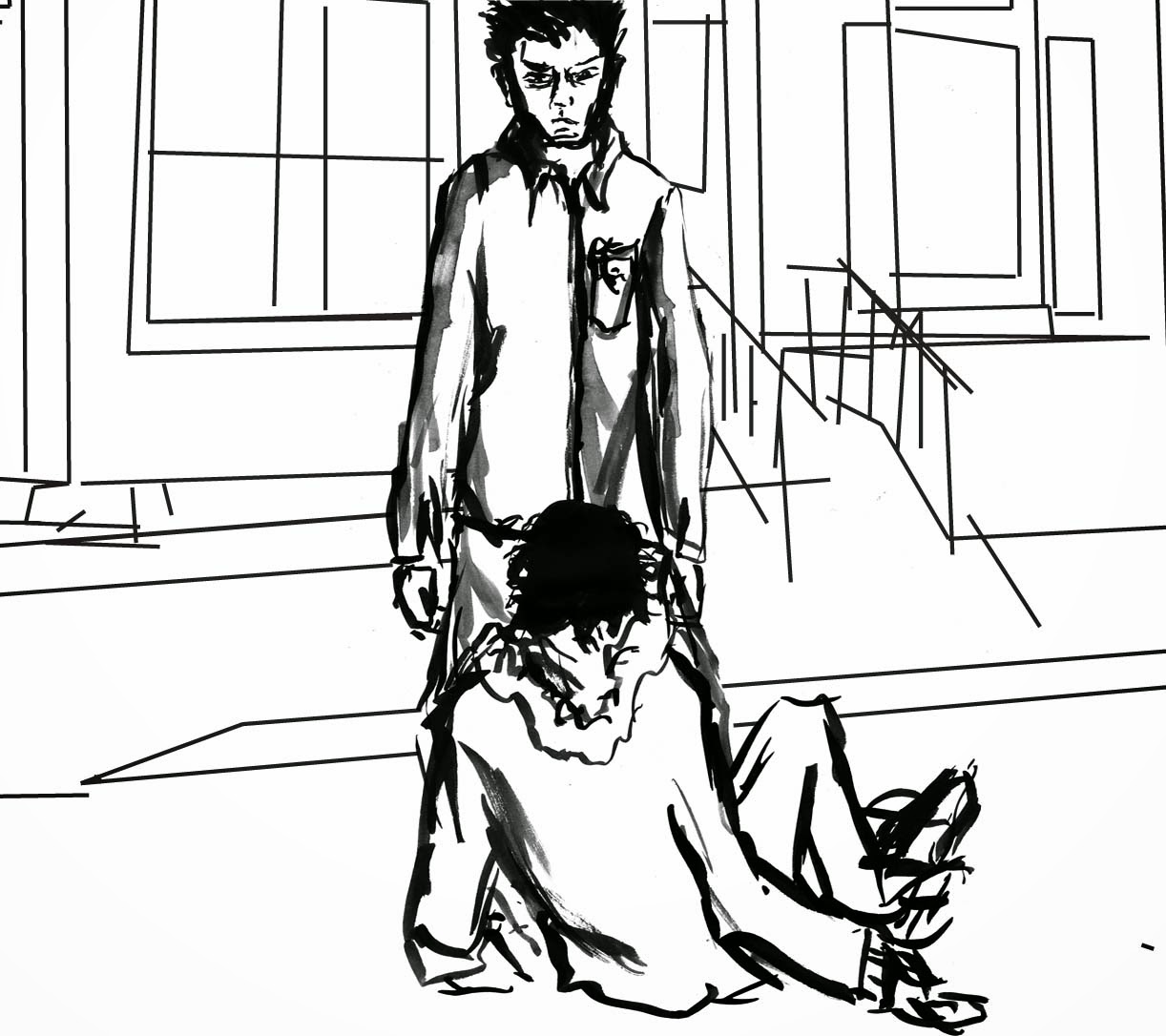
I decided to draw certain scenes from my storyboard plan thing. I thought it would be interesting to draw the figures in ink with a brush, the way I drew most of my work last project. I tried doing the figure and background separately and then combining the two on Photoshop. This allowed me to try out a multitude of different types of background to see how they work out. The piece to the right and below to the left I don't think work because the characters merge in with the background too much due to a similar quality of line. The middle bellow one works better due to a variance of tone but the line quality is still very similar. The piece to the right does not have this problem. I attempted to create the background of this piece in Illustrator so the lines are very clean cut. Unfortunately I am not skilled enough at Illustrator to draw something as complex as a building in any adept way and the little bit I was able to do took me a very long time as it is. I was left not really sure how to get a good balance between the figures and background,
Subscribe to:
Post Comments (Atom)


No comments:
Post a Comment