Saturday, 30 April 2016

I follow a guy on instagram who goes by Sunflowerman. He describes himself as a 'Menswear artist, so his work focuses on fashion and style like mine does but on a different section of that area.


 He recently posted two pictures that caught my eye because they are series of works similar to what I'm going for. One is a purely black and white series of very fashion like illustrations (focusing on clothes, a little more gestural) the other a series of more typical portraits coloured in a sort of normal watercolour style. I've been exploring work as series all year through my style work and it's interesting to see two series of work by the same artist dealing with similar subject matter to me. For my series to be exhibited I want to do a series that is linked together somehow like the series that Sunflowerman has done via his use of materials. Out of the two series (both of which I love) I find his black and white one more interesting, this might be because there are more pieces in the series (more is always better) but I also think it may be down to the unity given by only using black and white, each piece works with each other and the monochrome nature lets the work both flow while being intense (both things I want in the series I'm doing).

Friday, 29 April 2016

Maps Project

The website The Big Blue Swim wanted illustrators to design maps for their routes which are currently just depicted through google maps. Me and two of my friends decided to give it a go. We were ultimately unsuccessful at designing anything the website wanted to use but I'll write about the process anyway.

I decided I would draw the map in my usual way and then tweak it to their needs from there depending on what they say. I drew one map in fine liner pen then scanned it in and coloured it in photoshop before adding the route line and labels. I coloured the map relatively simply, a few shades of green for the land to give it a little three dimensionality with a bit of browny grey here and their to show changes in land style and white yellow for beeches, where appropriate. The sea I coloured a deep blue and then a lighter blue surf around the land. I thought the map looked very flat, sort of graphic designy so I added a slight old map parchment texture to the piece to make it interesting and bring the map alive, but still clear as to what was what.
After this I drew a map in ink and went through a similar process, this time making the colours a bit bolder and simpler as the suggestive nature of the ink isn't as clear or defines as my pen work.

I sent these pictures with a bit of writing about what I've done to the website. They replied that my line work needed to be a lot clearer, solid and more defined, they said the same about my two friend's maps as well but said mine was the furthest from what they were looking for. They also wanted simpler, clearer, bolder colouring. The colouring stuff was fine with me (though to be honest it seems a lot more boring) but I had already reigned in my sketchy line work a lot for the map drawing and while I could do more to get the style they want, because it's so against how I usually do work it would have took me a long time to draw the map and a lot of concentration and effort while doing so. It just didn't seem feasible for me to continue this project while also making all my work for my degree show.
It seemed like they wanted something very graphic design, and there's a reason I do illustration and not graphic design.


Tuesday, 26 April 2016

Pablo Carpio

 Pablo Carpio is a concept artist I came across via tumblr. This was around the time I was thinking of taking my comic in a new direction. I wanted to work on larger more complete that I could take my time composing and colouring rather than having to deal with all the restrictions of a standard comic layout. Carpio's work is more of an example of the sort of work I wanted to make. I altered my comic to be more of a montage of full complete digital paintings showing the narrative I had planned in a looser sense.
Carpio's work is an example of what I'm going for with vast strong landscapes with figures more subtly put in, small and over-scaled by the immense epic landscapes that take the forefront of his illustrations.


sources:

http://imgs.abduzeedo.com/files/articles/dazzling-artworks-pablo-carpio/pablo-carpio-maraver-zanastudy2.jpg
http://41.media.tumblr.com/93bd0f48216be257447afe43b9123d7a/tumblr_npin5dsp6p1unb4zyo2_1280.jpg
http://41.media.tumblr.com/efb9a78eea70c007df68b889574ade72/tumblr_o45m1yTZjf1qhttpto4_1280.jpg

Saturday, 23 April 2016

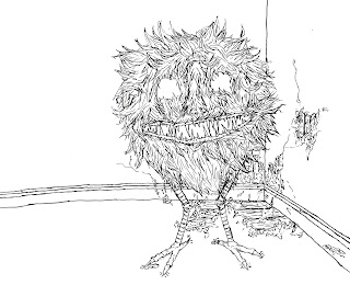
Demons project

Just before Easter a graphic design student needed an illustrators help for the drawings in a book she was making. The graphic design student had seen my Corridor exhibition work and thought my style would work well with the typeface she had created for her book and the subject matter of the book, which was demons. I talked to the graphic designer and her tutor about what they wanted and since it seemed simple enough I agreed to do it. They wanted a series of seven drawing each of a different sort of demon. They wanted me to use the style I had used in my style series with sharpies. These sharpie drawings I actually do very quickly and find really easy to create, so in theory the project should be easy to do.


The size of the images were 170mm by 200mm which was the size of the book. I scaled this up to a size close to A2 to do the actual work though as the student wanted me to work on a bigger scale so I could get the detail and intensity I got in my series of works. I found it awkward as even though A2-ish is a lot bigger than the A6 series the stye is inspired by, the fact that I'm drawing entire creatures rather than just bits (like the majority of my work) and filling in a background in that area to which meant the actual body of a lot of the demons was smaller than I'm used to drawing in sharpie.

Drawing the demons was also an interesting challenge. The style work that influenced the pieces were all drawn from photographs, obviously this can't be the case with demons. On top of this the demons included in the book are all rather odd ones that I've never heard of and that only come up with a few results in google images. The graphic design student sent me a list of the demons with a brief description and what needed to be included in the drawing. She also sent a few reference images of each, although nothing too clear. It was enough to work from though.
I drew up initial designs of the demons and the compositions of the pieces in my sketchbook first, then drew them in the page layout I had on A2 paper. I then sent these to the student and sorted any issues either on photoshop or by placing a piece of tracing paper over the initial drawing and tracing over it making adjustments where needed. The sorts of things that generally needed changing were like, these lips should be different or the lines here need to be thicker, so nothing too hard to change in these ways.


Tuesday, 12 April 2016

Style block

After Christmas I went through a period where I really had no idea where to go with my style project. I had been making various series of work based on style for a while and got in the habit of working on a smaller and smaller scale, I was taking my own model photos but didn't really know what to do with them. I was continuing making series of work but it felt very repetitive, like I was just repeating what I did earlier in the year. I started to focus more on my narrative work while I kept the direction of my style project in the back of my mind. One day I realised a simple solution to do something different would be to make some big work based around style. This lead to me just doing some relatively quick A1 drawings of a few of my photos in various different ways. I didn't really know where the work was going but it was enough to get me out of my rut. The work I made was alright but a little boring, there wasn't much to them. The works were too big to work in a series, and as I always mention work always works better in a series. Anyway this work was different enough to allow me to think of other possibilities I could take with this project. This includes ideas similar to ones I've already done which I was avoiding at first because of repetitiveness, I now feel I can go back to these ideas and feel like I'm developing them rather than repeating them.

Sunday, 10 April 2016

The Art Walk/ T1 corridor exhibition

This post is coming a bit late (about 4-5 months late). Just before Christmas some of our course, including me set up an exhibition in the T1 corridor of our building. I was the curator for the Illustration side of our course. The whole event served as like a mini practice session for our final degree show (in which I'm one of two curators for illustration). I submitted two pieces of mine for the exhibition.

 Thinking about how to present my work was pretty useful, both in how to present the piece itself, how to make use of the space and having it go with the flow of the other pieces in the exhibition. Obviously this involved thinking about everyones work together rather than just my own and this is what a big part of being a curator for the degree show will be as well.

In the end everything was pretty simple and the exhibition went smoothly though it was quite a bit of work making the area ready to exhibit and putting up all the work.

Fashion illustrators continued

Richard Kilroy

I find Kilroy's style pretty boring... incredibly boring. I really hate this style of clean photorealistic realistic black and white work. It always seems kind of plasticky and unless the lighting is incredibly dramatic it will always appear flat; and not in the good way. In an uninteresting, nothing to elevate from the page and actually make make the viewer look or think about the work kind of way. Luckily as you can see in the photos Kilroy only uses this style on some of the figure, leaving the rest of the figure to be drawn with limited basic line work. While I don't like the style of his detailed areas I do think the contrast between the detailed and empty areas of his work is very interesting and could work well if applied in some way to my own work with my more interesting sketchy linear style.


Julie Verhoeven 

Verhoeven's work is very different to mine. It is pretty abstract and loose in a grotesque sort of way and colour is in general used in a much greater way than in my work. She kind of reminds me of Egon Schiele except her work is a bit more expressive and loose, in a grotesque way. While their is a lot of looseness in Schiele's work it is a controlled purposeful looseness while Verhoeven's comes across as more wild and thus the end result appears warped and grotesque as apposed to Schiele who's work I find visually appealing. I'm sure that's not what Verhoeven's work is going for but it is what my work is aiming for, our styles are simply very different.

There are some things I can take from her work however. These are things like her use of different coloured line work, as apposed to just black, and the strength of her lines as well as the loose way she uses ink sometimes being pretty interesting and not jus unappealing. She also deals with interesting poses, something I'm also working with except she exaggerates and warps her poses past a point of aesthetic pleasantness.


Antonio Lopez


I really Lopez's work. He has a strong intense graphic style and uses a range of marks and tones throughout his work. It has that flatness that I've been talking about but the dynamic brush work and marks bring the work of the page and make the work not only visually interesting but aesthetically appealing as well. While his work deviates a bit (though not that much) from my own the end result is pretty much what I'm going for, Something that shows of the aesthetic quality and style of the model themselves while  also bringing attention to the fact that it is still a drawing and presenting these two aspect in tandem.  An interesting thing about his work that I really like is how he keeps the skin of his models clear, not doing any tone work. I've looked at artists who do similar techniques, usually to separate the clothes from the model themselves. This doesn't happen with Lopez's work however the model and their clothing, and their hair are blended seamlessly to be one being (exactly what I'm going for in my own work). I put the reason that these elements work together in his work down to using a strong use of line for the skin areas of the model and the same sort of line for the clothing as well, connecting the drawing by having the same basic structure throughout despite different marks and shades being used within to present the differences in texture and material.

Image sources:
https://s-media-cache-ak0.pinimg.com/736x/39/44/19/39441980b72554d854c82a5875501ed8.jpg
http://lfwdaily.com/wp-content/uploads/2011/06/Julie-David-610x769.jpg
http://www.jujuchan.com/wp-content/uploads/2012/06/PlasticDreams2JulieVerhoeven.jpg
http://www.fashionillustrationgallery.com/wp-content/uploads/02390_AL_il_figsite.jpg
http://www.bklynlibrary.org/sites/default/files/imagecache/exhibition_large/images/events/exhibitions/2012/Antonio%20Lopez_BROOKLYN__1_300dpi._H-7_%5B1%5D.jpg

Saturday, 9 April 2016

Fashion artists

Even though I don't consider my Style based work fashion illustration there are still obvious overlaps between the two. This means I have looked at quite a few fashion illustrators and artists over this project, though many only in passing.

Rene Gruau

Gruau has a very flat style in a lot of his work (at least the work of his that interests me) that I find visually striking and impactful at first but capture my attention for long. This may be fine for work in magazines and such to initially get the viewers attention but I feel like if the work was a little less simplistic but still maintained its flatness  then it could be more visually interesting, maybe if some hints of texture were added (which he admittedly he does do every now and again).

I feel like this would be sort of similar to my sharpie work which is pretty flat but still interesting due to the sketchy nature of my work.
In general my drawings have a lot more going on than his which isn't necessarily a good thing but in this case I think it makes my work more visually captivating and interesting although the simplicity and graphic quality of his work may be more impactful initially.


Rene Bouche

Apparently Rene is the name to have if you want to be a fashion illustrator. Bouche's work is rather linear, with strong varied lines, kind of scribbly and used well with great effect to convey differences in material and texture. The way he uses differing lines and techniques to illustrate these differences is what interests me most about his work and is something I'm trying to achieve with greater clarity on my own work.
For example in his ink work he  leaves the skin plain tonally  while detailing the clothing with a wide spectrum of tones and washes. The hair is similar but less detailed than the clothing. Also while the hair and skin of the model is drawn rather definitively the clothing is a little more loose and gestural, while still having some intensity. In my ink work I use a similar disparity of marks and gestures to get a similar effect but unlike Bouche I don't put any emphasis on making the clothes stand out so draw every aspect of the model in the same sort of detail. This difference in Bouche's and I's work is due to how he is a fashion illustrator so his work is all about the clothing at the core; my work is more about the identity of the model as a whole so as much emphasis is put on the model themselves as the clothes they wear. While I do use different techniques and marks to show different materials and textures I also keep some similarities running through a piece to present each aspect as a whole unified being.


I'll write about other fashion illustrators in upcoming posts.

Image sources:
 http://www.palaisgalliera.paris.fr/sites/galliera/files/styles/cloud_zoom/public/oeuvre/visuels_principaux/77439-26_1.jpg?itok=N55FiNtg  
http://archdezart.com/wp-content/uploads/2011/12/gruau2.jpg
https://thewitcontinuum.files.wordpress.com/2013/05/33524-rene-bouche-1955-p2-christian-dior-jacques-heim-evening-gown-hprints-com.jpg
https://s-media-cache-ak0.pinimg.com/736x/07/05/65/070565d965d62a623cb6599fe32d81c4.jpg


Scott McCloud, Reinventing comics

I'm currently reading Scott McCloud's Reinventing Comics, the sort of sequel to Understanding comics. I've only just started it so don't have much to say about the book itself at the moment. I wanted to read it because while Understanding Comics was incredibly thorough and analytical when it came to about every aspect of comics it was written in the early 90s. This means a lot of new developments in comics are obviously not included as well as predating the digital revolution that completely changed the way a lot of comics are made compared to the 90's. Also Scott McCloud often mentions possibilities in comics that are yet to be explored in Understanding Comics but with the recent comic renaissance of the moment are being actualised.
Having said all that Reinventing Comics was only written in 2000 so isn't particularly recent and was published just before what I've talked about came to light. In fact the comic world of the late 90s was going through its most dire period ever, less were being made, those that were were in general unoriginal and not very good and no one seemed to be buying comics anymore. I expect McCloud will have insights about this dire time in the book but I hope he is perceptive enough to foresee what is to come and talk about that too. Either way if it's anyway near as good and useful as Understanding Comics then it will be worth the read.

McCloud, S. (2000) Reinventing Comics. New York: Harper Collins.