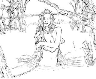
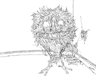
 Just before Easter a graphic design student needed an illustrators help for the drawings in a book she was making. The graphic design student had seen my Corridor exhibition work and thought my style would work well with the typeface she had created for her book and the subject matter of the book, which was demons. I talked to the graphic designer and her tutor about what they wanted and since it seemed simple enough I agreed to do it. They wanted a series of seven drawing each of a different sort of demon. They wanted me to use the style I had used in my style series with sharpies. These sharpie drawings I actually do very quickly and find really easy to create, so in theory the project should be easy to do.
The size of the images were 170mm by 200mm which was the size of the book. I scaled this up to a size close to A2 to do the actual work though as the student wanted me to work on a bigger scale so I could get the detail and intensity I got in my series of works. I found it awkward as even though A2-ish is a lot bigger than the A6 series the stye is inspired by, the fact that I'm drawing entire creatures rather than just bits (like the majority of my work) and filling in a background in that area to which meant the actual body of a lot of the demons was smaller than I'm used to drawing in sharpie.
Drawing the demons was also an interesting challenge. The style work that influenced the pieces were all drawn from photographs, obviously this can't be the case with demons. On top of this the demons included in the book are all rather odd ones that I've never heard of and that only come up with a few results in google images. The graphic design student sent me a list of the demons with a brief description and what needed to be included in the drawing. She also sent a few reference images of each, although nothing too clear. It was enough to work from though.
I drew up initial designs of the demons and the compositions of the pieces in my sketchbook first, then drew them in the page layout I had on A2 paper. I then sent these to the student and sorted any issues either on photoshop or by placing a piece of tracing paper over the initial drawing and tracing over it making adjustments where needed. The sorts of things that generally needed changing were like, these lips should be different or the lines here need to be thicker, so nothing too hard to change in these ways.


No comments:
Post a Comment