Monday, 5 May 2014
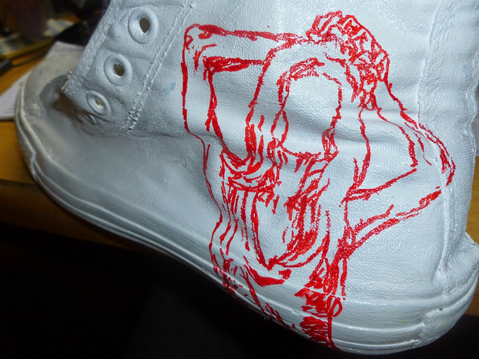
I had a pair of old shoes that didn't work anymore so I decided to paint them white and draw on them. I painted them with acrylic since that's all I had. I didn't really draw on them for any other reason than it was something to do with them but it it was useful practicing more with sharpies and making use of their 'draw on anything' quality by working on a different kind of surface. I once again didn't give the figures faces for no other reason than at the moment I like how that looks.
This is what my work looks like with the two revised pieces. While they still both stand out they fit in with the rest of the pieces better than the originals.
Unfortunately when I took this piece down from the exhibition I neglected to take the blue tack off the back of the pieces and they stuck together. Whilst removing the blue tack I caused a lot of minor damage tp a lot of the pages that I'll probably have to go back over and rectify.
I've also been thinking about how to better present the series of work since the exhibition. An obvious solution would be to get rid of the current format of presenting the work altogether and make the pieces into some sort of book either with or without the original text I drew from (siren's of titan).
I also thought of adapting my current way of presenting the work by instead of laying the pages out as a sort of square, laying them out n one long line. This was awkward to photo so I tried filming the line to try and recreate the look. I prefer this layout to the original as I feel I have enough pages to get the maximum affect from having a line of work whereas before the work seemed underwhelming and like it should be bigger. It still doesn't have the effect I aimed for when I started this project but at least it's closer to it than the original layout.
Unfortunately when I took this piece down from the exhibition I neglected to take the blue tack off the back of the pieces and they stuck together. Whilst removing the blue tack I caused a lot of minor damage tp a lot of the pages that I'll probably have to go back over and rectify.
I've also been thinking about how to better present the series of work since the exhibition. An obvious solution would be to get rid of the current format of presenting the work altogether and make the pieces into some sort of book either with or without the original text I drew from (siren's of titan).
This was the start of a piece I was doing for my drawing project. I was trying to draw in a new, loose way by quickly drawing lines with ink using a big brush. The problem with this was I was using ink too quickly and loosely so the image quickly got too distorted out of proportion for me to bother carrying on. Looking back on it now I don't think it looks too bad and I wish I'd carried on, unfortunately the drawing is 200 miles away.
During the drawing project one of the main things I've been thinking about (other than ways of combining colour into my drawing) is the scribbly nature of my drawing and the general sketchiness of my work. I actually really like this quality of my work so rather than learning to draw in defined linear way (which if needed can always be achieved using Photoshop or Illustrator) I would rather learn to make the most of my works inherent sketchiness. To do this I have looked at a variety of artists who have a similar use of line or style.

Benoit Jacques (http://www.desordre.net/bloc/images/benoit_jacques_l_grande.jpg)
I like how Jacques uses lines to do everything in his work: shade, texture, add depth etc.I think the consistency of all the lines throughout his work are what make his work visually work and a dynamic quality to his drawings. My one concern with this approach is that finer details can easily get lost amongst the line and the drawing may not always be clear.
Raymond Pettibon (http://purple.fr/filestorage/cache/blog/9/7910/-11_balestin/-11_balestin_700_0_resize.jpg)
Raymond Pettibon's style is less scribly than Jacques, in fact the outline of the figure is pretty solid and defined. The way he's used line for shading however is pretty scribbly as is the background. I like this technique because it keeps an interesting, vibrant sketchiness to the work while also having it be more solid and defined unlike jacques work.
Vince Low (http://www.behance.net/VinceLow)
Vince Low's work is completely scribble but unlike the other artist's his work very structured and organised still. I think this takes away from the appeal of more natural sketchy work. It seems to me a better way to get a similar aesthetic effect would be to use defined normal lines. I would say his drawings lack the randomness that gives real sketchy/scribbley work it's appeal. His work is similar to Dryden Goodwin's but I prefer Goodwin's work because the use of line is more loose (despite being sharper) and chaotic.
Benoit Jacques (http://www.desordre.net/bloc/images/benoit_jacques_l_grande.jpg)I like how Jacques uses lines to do everything in his work: shade, texture, add depth etc.I think the consistency of all the lines throughout his work are what make his work visually work and a dynamic quality to his drawings. My one concern with this approach is that finer details can easily get lost amongst the line and the drawing may not always be clear.
Raymond Pettibon (http://purple.fr/filestorage/cache/blog/9/7910/-11_balestin/-11_balestin_700_0_resize.jpg)
Raymond Pettibon's style is less scribly than Jacques, in fact the outline of the figure is pretty solid and defined. The way he's used line for shading however is pretty scribbly as is the background. I like this technique because it keeps an interesting, vibrant sketchiness to the work while also having it be more solid and defined unlike jacques work.
Vince Low (http://www.behance.net/VinceLow)
Vince Low's work is completely scribble but unlike the other artist's his work very structured and organised still. I think this takes away from the appeal of more natural sketchy work. It seems to me a better way to get a similar aesthetic effect would be to use defined normal lines. I would say his drawings lack the randomness that gives real sketchy/scribbley work it's appeal. His work is similar to Dryden Goodwin's but I prefer Goodwin's work because the use of line is more loose (despite being sharper) and chaotic.
Saturday, 3 May 2014
Here are my revised versions of the rwo pieces that I felt needed redoing from my exhibition, These two are both darker and fit with the colour scheme of the other pages more than the originals. I changed the fountain picture so that it was a birds eye view of it instead. This may make the piece less clear on what it is but fit with the concentric circle/ spiral theme of the work.
Wednesday, 30 April 2014
Due to being unable to get photos from my phone to my laptop I am unable to post pictures from the 1 day exhibition my course and I set up in uni. For this exhibition I presented work from my: grandmaster project, responding to a text and drawing transformation for which I exhibited two of my favourite life drawings I've done this year. I obviously exhibited my 'Supercalifragilisticexpialidocious' comic and my current work for the other two projects.
It was useful planning and seeing what my work would look like within the context of an exhibition. This is especially true for my current project which is the only one of the three that is really made for an exhibition or gallery setting. As I mentioned I don't have any photos from the exhibition itself but this piece didn't look too different from this photo I posted before. The key difference was this time I could have a proper look at all the pieces as one because they were stuck on a wall (actually it was two tables on their side) and not laid out on a floor. This allowed me to see any problems with the piece/s. First off I don't like the 2nd picture on the second row and the 5th piece on the 3rd row. I just don't think they really gel with the flow of the rest of the work. I think the main reason for this is they both boldly use colour and colours that aren't in any other pieces. I'm going to redo these two. To a lesser extent
I also have problems with 1st and 6th piece 2nd row and 1st piece 3rd row. This is mainly down to the way the silhouettes are done because I don't think they look natural or human enough. This isn't a major concern however because I still think they work alongside the other pages.
My other concern is that my way of laying out the work didn't quite have the impression I wanted it too. It just looked to small and rather ineffectual. Simply put there wasn't enough pages to create the impression I wanted it too. Due to this I'm going to try presenting my work in other ways maybe, with different layouts.
I want to finish by quickly talking about my comic in the exhibition. Obviously the comic is made to be a comic and not really to be exhibited so to make it more interesting and eye-grabbing in a exhibit context I presented the original larger pages of the comic with it. I think it's important to show things like this because often the process and original pieces of art are more interesting and important than the final product itself. That's what I think at least and is probably why most of my work is just sketchbook stuff because to me that is the most interesting and even best looking work.
Thursday, 24 April 2014
Drawing Project
I continued exploring drawing with colours which is something I've explored quite a lot in this project. Here I've tried it with oil pastel and below with sharpie and ink. I liked drawing with pastel even though I couldn't get the sharpness and intensity of line that I'm used to getting. The drawings below are more of me exploring using sharpies than colour. I started by just doing a normal line drawing I the layered ink of various colours. I would have usually stopped after each layer of media but wanted to see how it would look if I kept adding to it. I took photos of each stage with my phone but unfortunately my phone isn't sending pictures to my laptop correctly. This means I only have the two images bellow to show for now.
I really like these two drawings. They are similar in a lot of ways. They both have an obvious roughness and sketchiness to them both are ink with blonde hair and are of a similar faceless subject matter. The picture on the right came about when I looked at one of the pieces of paper I wipe ink and brushes on and thought that it may look good with a drawing over the top. The drawing on the left was supposed to be just a routine loose ink drawing but a defunct dip pen lead to smears of ink that were hard to control creating a very rough image. I then finished it off with a brush that I think gave a pleasing contrast in line and texture while adding to the roughness of the drawing.
Subscribe to:
Posts (Atom)