Friday, 21 February 2014

I was having trouble working with A2 sized paper so I decided to go down to A3 paper, to work on an A4 space to finish up with A5 pages when scaled down. I was thinking of making my comic A5 sized in the end anyway. This is because when I was looking at graphic novels and comics to inform my work I realised I really liked the general layout of the Scott Pilgrim comics by Bryan Lee O'Malley, so I want my comic to be a similar style.

I also think that the way I've been doing the comic -taking shots directly from the film and adapting them, is taking too long and I may not get to the point in the story where I want to. Since then I've been coming up with my own compositions too quicken the pace of the story. This gives me more freedom when drawing the scenes but I need to think more about how everything is laid out so that it flows and works for telling the story, it can also be hard if I want to do something complex as I may not have a source to work from. While the tempo of the story has increased and I'm moving through the film quicker it's taking me some time to get used to this method while keeping the quality of the images up and the story coherent. At the moment a lot of the panels are a lot more empty and less detailed than some of the earlier ones.

I've started scanning my pages onto the computer in preparation for making my final booklet. I tried starting to put it together using inDesign but realised I don't no anything about putting together a book on there so I've made an appointment with Stephen so that he can help me do this.

I've looked at a range of comics to inform my project and copied a few pages of some such as: Scott Pilgrim, Y the Last Man by Brian K. Vaughan (main artist- Pia Guerra) and Black hole by Charles Burns. I did this in hopes of learning things from their style to inform my own practice. With Scott Pilgrim, as I said above, I took the general structure and size of the book but it (and all the other comics I've copied from) also helped me (at least a bit) with general comic conventions such as sound effects, how to compose panels, how to panel out pages and when to leave out or put in a background and with how much detail.
The pages of Y the Last Man and Black hole that I copied both had panels where everything was at an angle, slightly askew. This gave either a chaotic, energetic feel to a panel or an uneasy ominous feel depending on the context. What I also liked from drawing Y the Last Man was the way that shadows were done, especially when combined with the pen I was using. I'm going to use this technique in my own comic and think it will work well with the dark tone I'm trying to create.


Tuesday, 11 February 2014

I've talked to a lot of my tutors the last week and they've got me thinking about a variety of things. Jill asked me whether I plan to actually change the story of Mary Poppins and this go me thinking about giving my comic more of a contemporary narrative arc. This would include a big reveal or some kind of twist most likely as seemingly everything these days can't be as they seem. I may also change little bits to increase the tempo as typically films these days play out faster than older ones.
Bob and Ian got me thinking about the range of marks I'm using to show different textures and layers in each of my panels. They also suggested I try going more loose with how I depict the drug hallucinations to give more of an unearthly vibe to those scenes. Here's an example of a reworking of the first scene to try and achieve this.

Christian said I need to work on a bigger scale. He says if you want to do an A4 comic then you need to work on an A3 sized space on an A2 piece of paper, so that you have a sort of margin. I haven't decided yet if I want to do an A4 or A5 comic or really anything about a finished comic product as when I started this I just drew pages as a way of sorting out ideas. My next step is definitely figuring out what I want the comic to be like in the wider sense, not just what's on the page.
I've also thought about using ink in my work just to convey pieces of block black in the background as this takes a long time with pen and may also help add more depth to my panels as there would a wider variety of marks.

Thursday, 6 February 2014

Drawing Transformation project


Just some messing around with a variety of ink straight on to the page


Tuesday, 4 February 2014

A lot of the scenes I plan to do in this comic are depictions of drug induced hallucinations. I plan on showing these hallucinations by colouring them while keeping the rest of the comic black and white.This is an idea that I've took directly from the Sin City comic 'Hell and Back' by Frank Miller. In the comic the main character gets drugged at one point and the comic breaks from its iconic black and white with touches of colour style and goes full colour until the character is given an antidote. I may also look into putting touches of colour throughout my work in the traditional Sin City sense just to give the work a little more depth and even take pressure off my mark making.


I've looked at Charles Burns on this blog before when I last did a comic and I'm looking at his work again. This time I'm interested in how he gets the dark, unsettling atmosphere in his work as a dark tone is what I'm going for myself. A lot of the atmosphere in his graphic novel 'Black Hole' (image source: http://claudionaccari.blogspot.co.uk/2011/01/copia-dautore-black-hole-di-charles.html) comes from his heavy use of black, especially in the background. I'm going to try and appropriate this in my work to try and suggest a darkness purely visually, even when nothing particularly unsettling is happening.


Saturday, 1 February 2014

Here are some examples of seemingly innocent things which people have put a dark spin on, which gave me the idea of this way of contemporising things.


Hogwarts was all in Harry's head theory

In fact if you go to http://www.creepypasta.com/ and search almost anything (especially children's TV shows) you'll probably find a theory on how nothing was as it seemed and everything was actually quite dark and messed up.
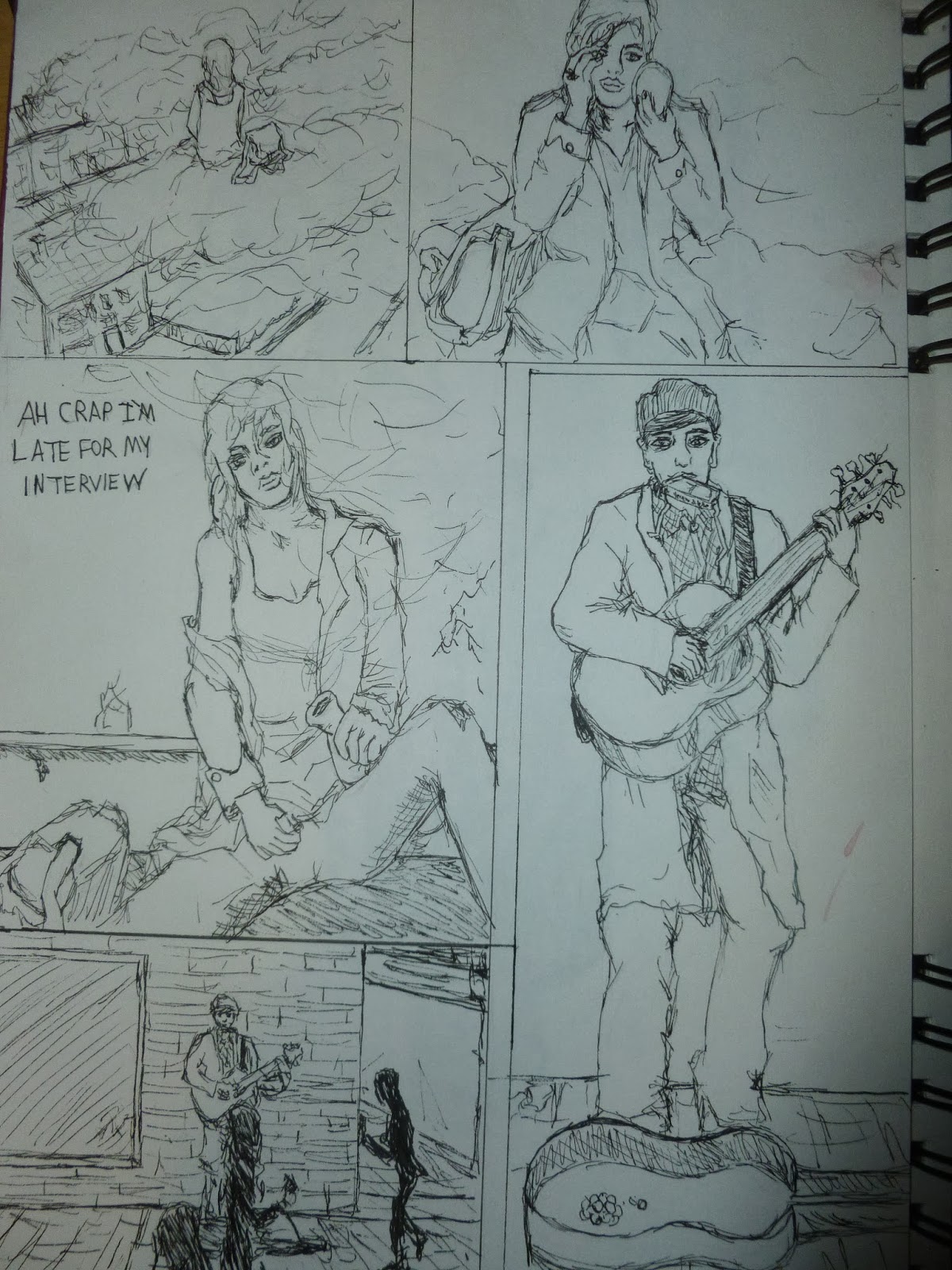
     Here is an example of how I plan to go about the work. You can see from my comic and the screenshots of the film how I plan to work. With Bert's one man band I decided to contemporise it a bit by making him a busker for this scene, this meant I used the film scene less as there was more I had to change.


I was thinking about what films I could make contemporary and came up with a little list of initial idea:
The Shawshank Redemption can become The Guantanimo Bay Redemption
Back to the future can become To the Apocalyptic Future
The Rear Window's window could change to Facebook searching or something similar.
Stand by Me can become kids searching for a dead body on the internet, possibly being unimpressed.
12 Angry Men would now be about a lazy jury who just didn't care or about members of the jury being paid off and coerced to reach a certain vote.
7 Samurai could be about 7 militants in the middle east protecting a village from drones or terrorists or a similar threat. The film could also be made contemporary by leaving it in its time period and making it more of a typical action movie with cheesy lines and such (Schwarzenegger-esque) 

The idea I'm going with at the moment is an idea I had a while ago of adapting Mary Poppins by setting it in the modern day and giving it a dark spin by explaining all the magical things in the film with drugs and mental illnesses. I may touch upon the other ideas as well though.
My plan for the moment is to adapt the film into a comic in which the panels are based off certain frames of the film, in terms of composition and layout but modernised and made darker.